01 - The Origin Story
A team built a product. A vendor conflict kept it from shipping.
Before Nurri existed, there was GenQ, a Duolingo inspired Quran learning app I had designed end to end as solo designer over four months. App, admin panel, every screen. It was complete. It was ready for App Store and Play Store. And then it didn't launch.
A conflict with the vendor froze the entire product before publication. The development team had built it. I had designed it. Nothing shipped. The company absorbed the loss, but the team kept the knowledge. Every component, every game mechanic, every design pattern we'd proven in production ready form.

GenQ App Preview : the project I'd designed end to end over four months. It was production ready. A vendor conflict prevented launch. The knowledge stayed with the team.
Nurri was born from that exact moment. Not as a pivot of GenQ, but as a new product with a different vision. Instead of chasing a broad Quran learning audience, Nurri would focus on Muslim children in Malaysia with gamified Iqra learning. New market, new positioning, new business model. The part that made six weeks possible was simple. We could leverage what we'd already learned about building Islamic education software.
The Strategic Reframe
"GenQ taught us how to build Islamic learning software. Nurri lets us build the right one. The hard-won knowledge becomes our head start, not our handicap."
What we kept and what we built fresh
Reused from GenQ
✓
Game mechanic patterns including multiple choice, build characters, and arrange the ayat.
✓
Component architecture from Figma and codebase, directly portable
✓
Hard-won understanding of Arabic typography rendering in mobile
✓
Knowledge of how Muslim users engage with Quran learning content
Built fresh for Nurri
✓
Complete brand identity covering logo, color system, and illustration style.
✓
Product vision focused exclusively on children aged 3 to 12, not GenQ's broader audience
✓
Malaysian market positioning, Bahasa Melayu content layer, MYR pricing
✓
A new product philosophy. Parent-first trust, child-first joy
This wasn't recycling. It was strategic leverage. The development team didn't have to rebuild patterns we'd already validated. I didn't have to redesign components I'd already iterated on. We turned a six-week timeline from impossible into ambitious.
The Core Team
02 - Design System and Branding
Brand. Then system. Then screens, in that order.
Nurri had no logo, no color palette, no mascot, no name strategy when I started. The previous project had its branding handled separately. This time, I owned all of it.
My first decision was foundational. Build the brand and design system before opening any product screen. Not because the timeline allowed for it, because it absolutely didn't. But because every product decision downstream would inherit these choices. Get the foundation wrong and you pay for it across hundreds of components later.
Logo and Identity
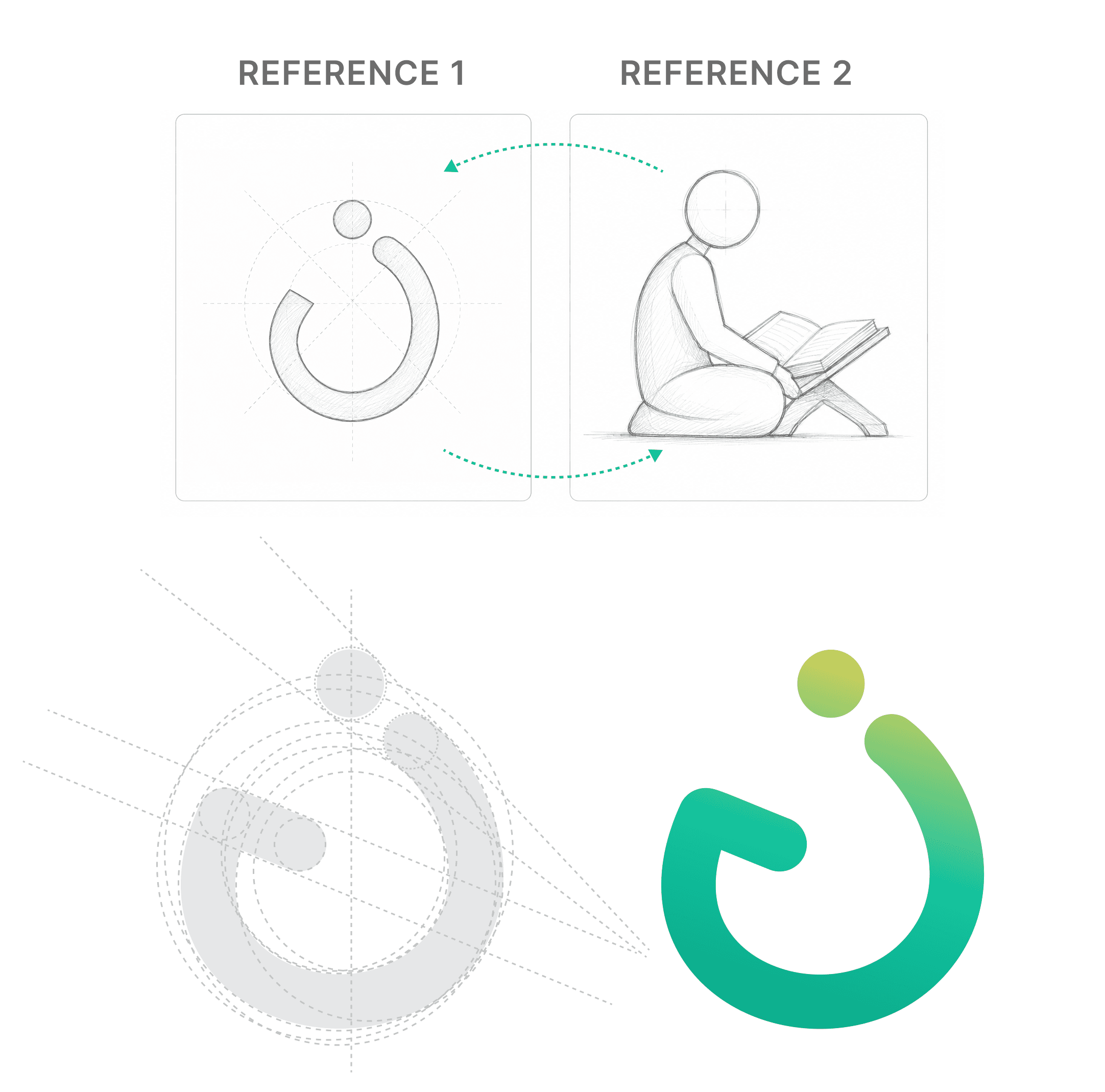
Nurri Logo : Three-panel logo study showing the Nurri wordmark in outline, filled silhouette, and final rendered color form.
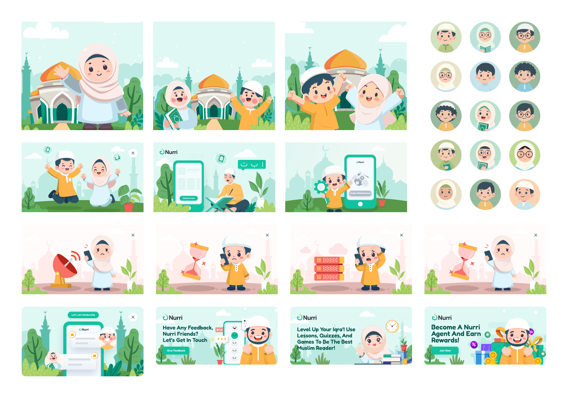
Nurri Illustration : The character used across onboarding, lesson completions, and empty states.
Typography. The decision that took the longest
What I did instead
I rebuilt the type system from scratch
Latin headlines
A soft, rounded sans-serif that nods to playfulness without competing with Uthmanic.
Latin body
A clean grotesque optimized for parent-facing UI such as subscription pages, settings, and reports.
Arabic display
Uthmanic Script HAFS at carefully tuned sizes. Because the font's intrinsic line-height, letter spacing, and harakat positioning don't follow any standard rules, every Arabic block in the app required manual override of the design system's spacing tokens. I built a parallel set of Arabic-specific spacing rules just for this font.
Typography System : Type specimen showing how Latin display, Latin body, and Uthmanic Script HAFS work together. Include sample sizes, weights, and the custom Arabic spacing rules.
03 - The Mobile App
Three modes, one learning loop, and a thousand decisions about how children actually learn.
Why clean and modern, not "kid-loud"
"The product roadmap goes far beyond children. Nurri's vision extends into teen and adult Islamic learning ecosystems over the next two years. If I built V1.0 as a cartoon-heavy kids app, every future expansion would require a full rebrand. Restraint at the start is what makes scale possible later."
Getting Started - Course Selection
The reference points here were deliberate. Belajar Mengaji Iqra' + Suara by Syumul Studio for Iqra icon structure and learn mode content organization. Qara'a, an Indonesian Islamic learning app, for the clean section layout pattern. Duolingo for the fun, gamified visual language in game mechanics. But only at the structural level. The visual execution is entirely Nurri's.
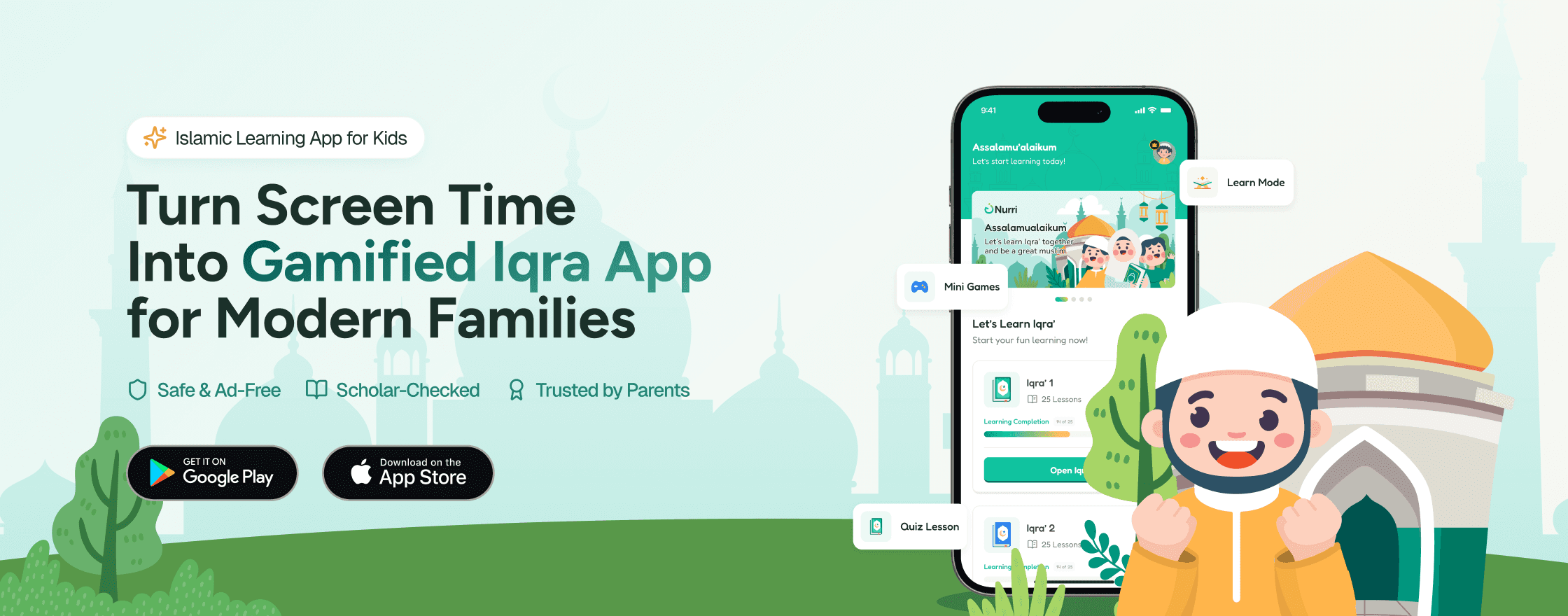
Adoption and Improvement for Nurri : Home screen with prayer time greeting, Iqra course list with progress, and prominent profile entry point. Course detail with Games and Learn shortcut buttons, lesson breakdown by Hijaiyah character.
Quiz Mechanics. Where the most iteration happened
✨ [Multiple Choice] The shape and color decision
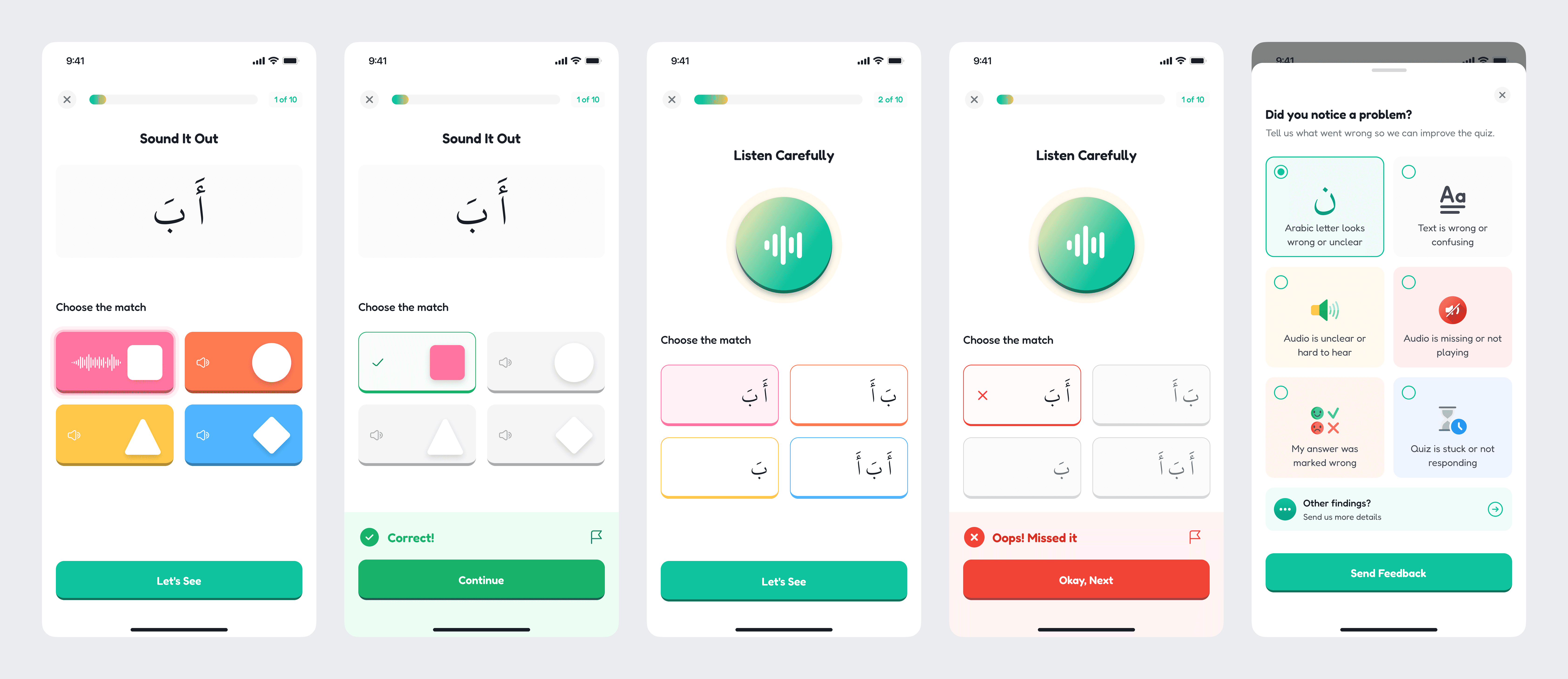
Multiple Choice Game Mechanic : (1) "Sound It Out" shows shape-and-color answer cards that reduce cognitive load for children still building Arabic literacy. (2) "Listen Carefully" uses the same color system with an audio-led prompt. Visual scaffolding stays consistent across mechanics.
The CTO and PM both worried this would feel too game like and conflict with the brand's modern tone. We tested both versions internally during demo day. This was a recurring Google Meet ritual where the dev team would present the latest builds in front of CTO, PM, Tech Lead, developers, QA, and me as designer. The room would stress-test what worked and what didn't, then walk away with a clear summary of what needed to change in design, logic, or system.
The shape-and-color version was unmistakably easier for kids to engage with. We shipped it. But with one critical constraint. The shapes only appear in game mechanics, never in standard UI. The line between fun and frivolous is held precisely.
✨ Build the character and Arrange the ayat
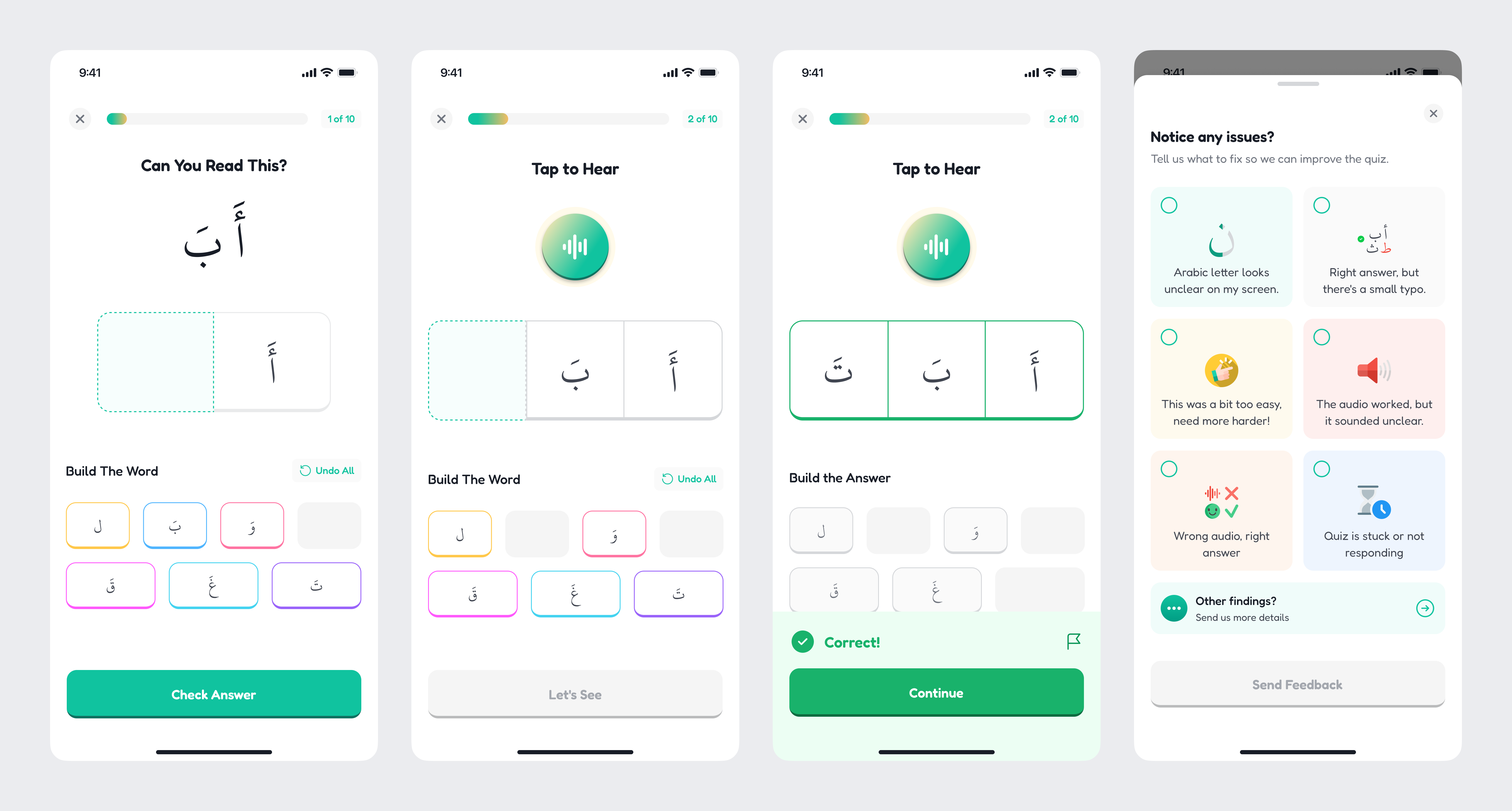
Build Characters Game Mechanic : This game mechanic asks the user to drag scrambled letters into the correct sequence to form a word.
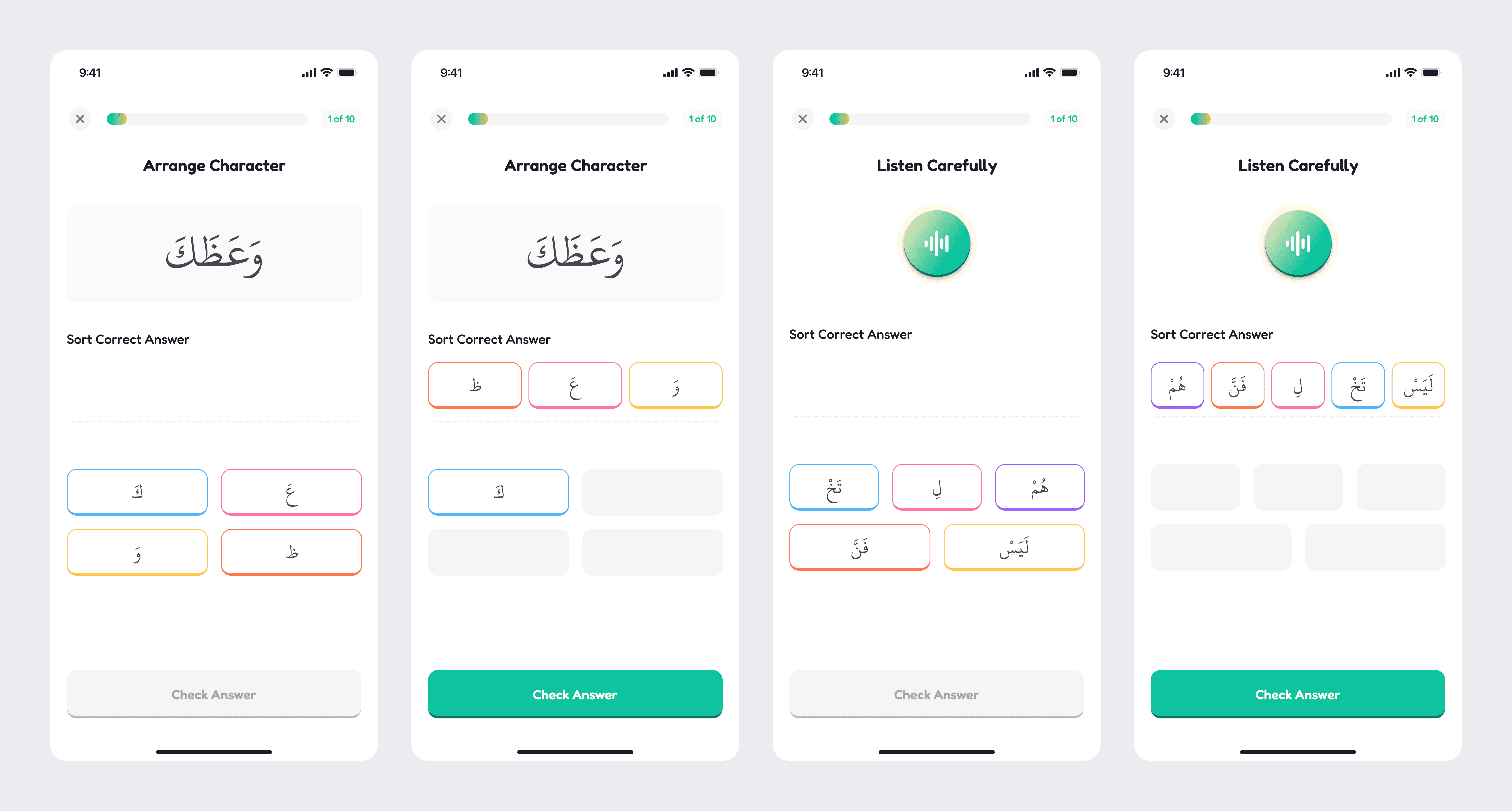
Arrange The Character or Ayat : (1) Arrange Character variants showing different difficulty levels with audio and text prompts. (2) "Arrange This Ayat" shown in three states: initial, in-progress, and correct submission.
Learn Mode. The block system

Learn Mode : Learn Mode in action. The block grid system shows the same template rendering different content density across Iqra volumes.
Iqra Flow. My first game UI

First Draft : CTO's prototype. Functional, dark, minimal. A pure logic test on desktop. Game logic proven! Tile spawn, difficulty curve, and scoring system all working. Try it here!
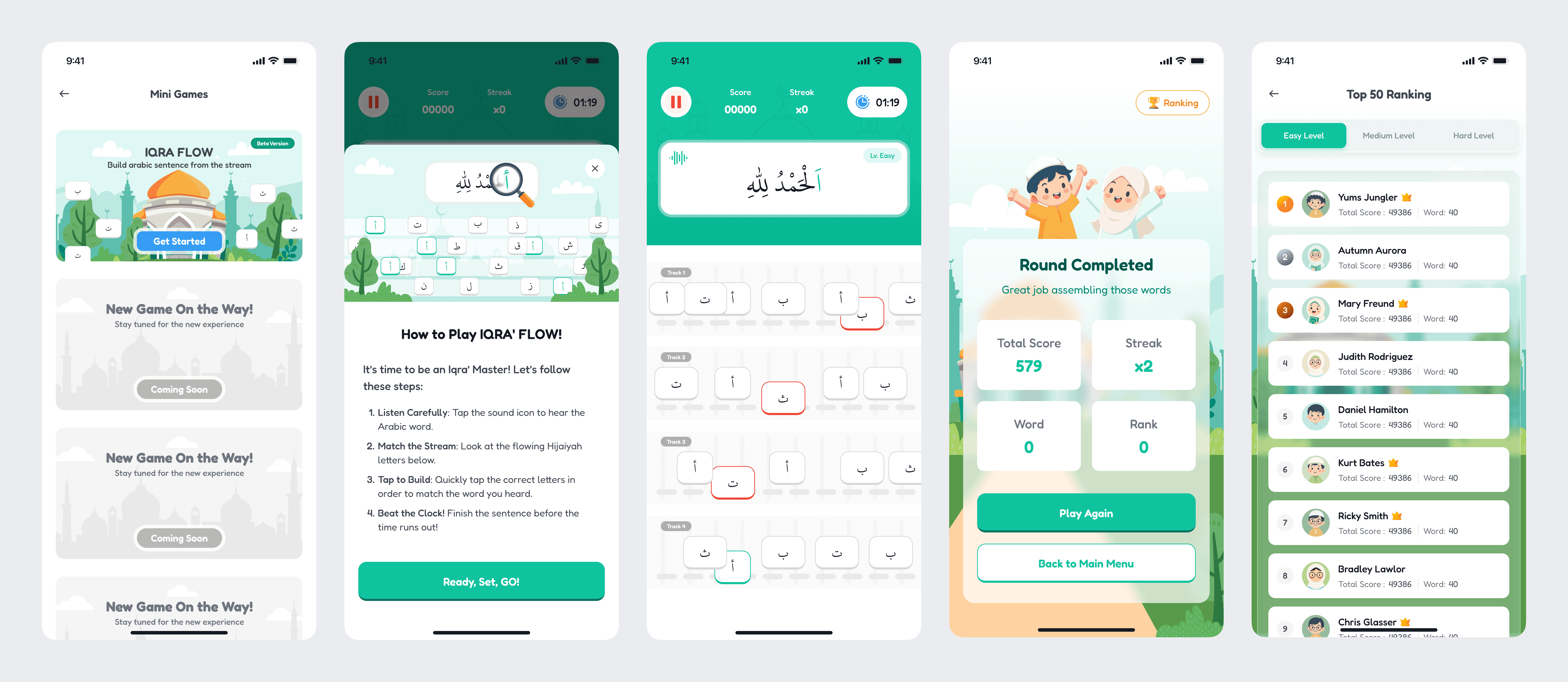
Nurri Mini Game Style : (1) Mini Games Entry - Iqra Flow announced with Islamic illustration, beta version tag, and two upcoming games teased. (2) On Boarding - Four-step "How to Play" with mascot moment and clear action wording for children. (3) Gameplay - Score, streak, and timer header with four-track horizontal lanes, Islamic backdrop, and high-contrast tiles.
Ownership Transformation between CTO and me
What I owned in the transformation
✓
Visual system with teal-led header, Islamic illustration backdrop, and white tiles with high-contrast Arabic typography
✓
Game state UI including score and streak display, timer with pulse animation, pause overlay, and ready-set-go countdown
✓
Track layout with four horizontal lanes optimized for mobile thumb reach
✓
Onboarding screen with mascot moment and four-step instructions
✓
Difficulty selector and leaderboard system (proposed, approved, held for V2)
What the CTO owned
✓
Core game logic including tile spawn rate, scoring rules, and difficulty parameters
✓
Sentence pool architecture and content selection logic
✓
Initial functional prototype that proved the mechanic works
The framing I learned to hold is simple. The CTO defined the mechanic, I designed the experience. This isn't reduced ownership. It's professional collaboration. The best game designers in the world work with engineers who hold the systems logic. My job was to transform a logic prototype into a moment of joy a child wants to come back to.
04 - The Admin Panel
The hardest design work no user will ever see.
Most of my time in V1.0 was visible in the mobile app. Most of my hardest design work was invisible. Buried in the admin panel that lets content admins manage courses, lessons, quiz mechanics, assets, gamification rules, missions, and the affiliate program.
This was the surface where I learned the most about systems thinking. The mobile app rewards beautiful execution. The admin panel rewards correct execution.
The asset library. The moment I had to rethink everything
My first design for the asset library treated assets the way most designers would. A table with rows. Each asset has a label, a media file (audio or image), tags. Admin uploads new assets, organizes them, uses them across content. Clean. Standard. I shipped a first draft.
CTO, in design review
"An asset isn't just a file. It can be a question. It can be an answer. It can be both. The same Arabic letter 'أ' is the question in one quiz and an answer option in another. The backend tracks that role contextually. Your UI doesn't reflect this."

Asset Library Updated: The improvement contains some additional logic specially for setting every asset as question, as answer, or both. Now user can easily call an asset when arranging Nurri CMS.
The sample of Nurri CMS
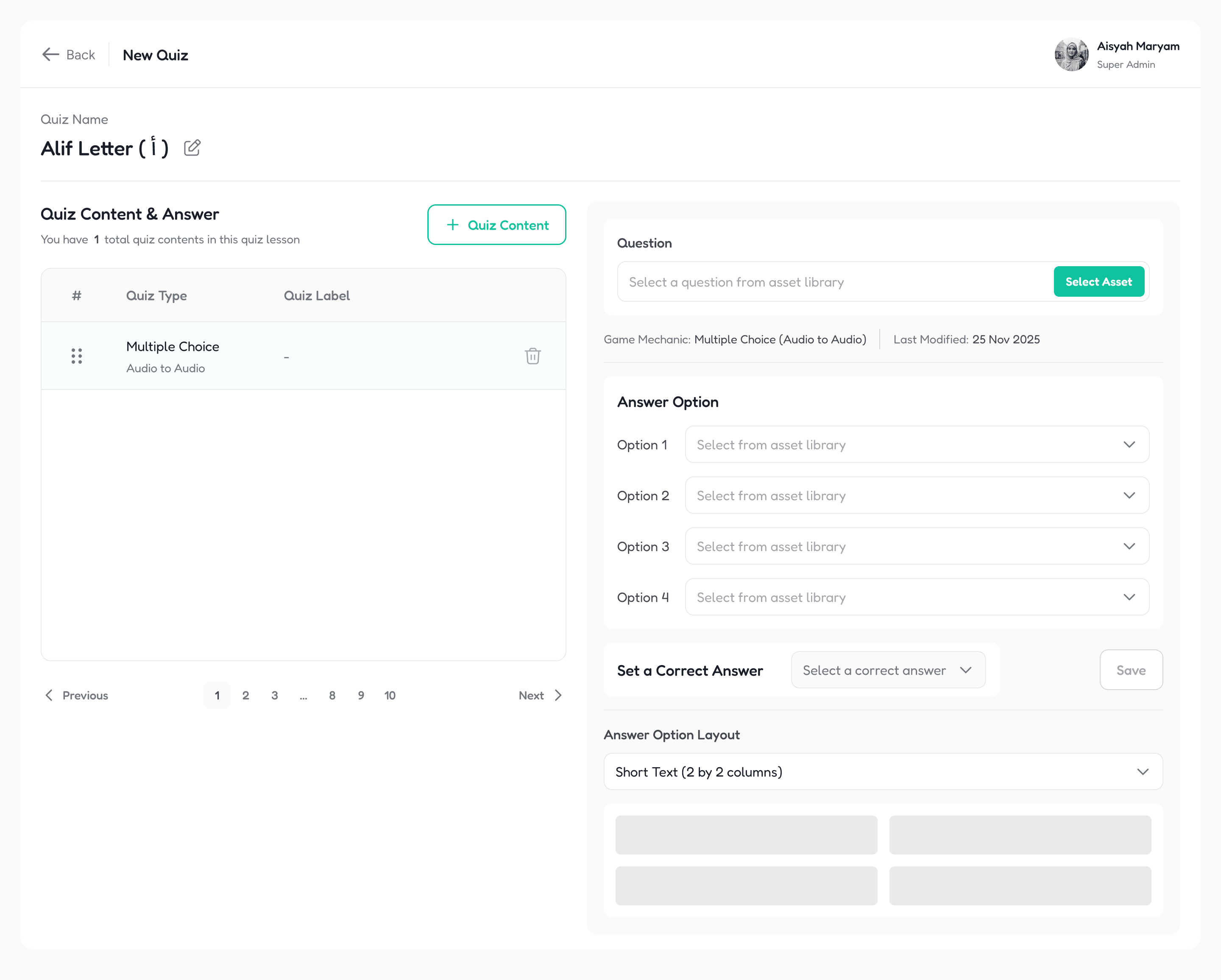
Create New Quiz : Quiz builder in empty state. Single dropdown to select asset from library. Layout selector below. Game mechanic auto-detected from selection.
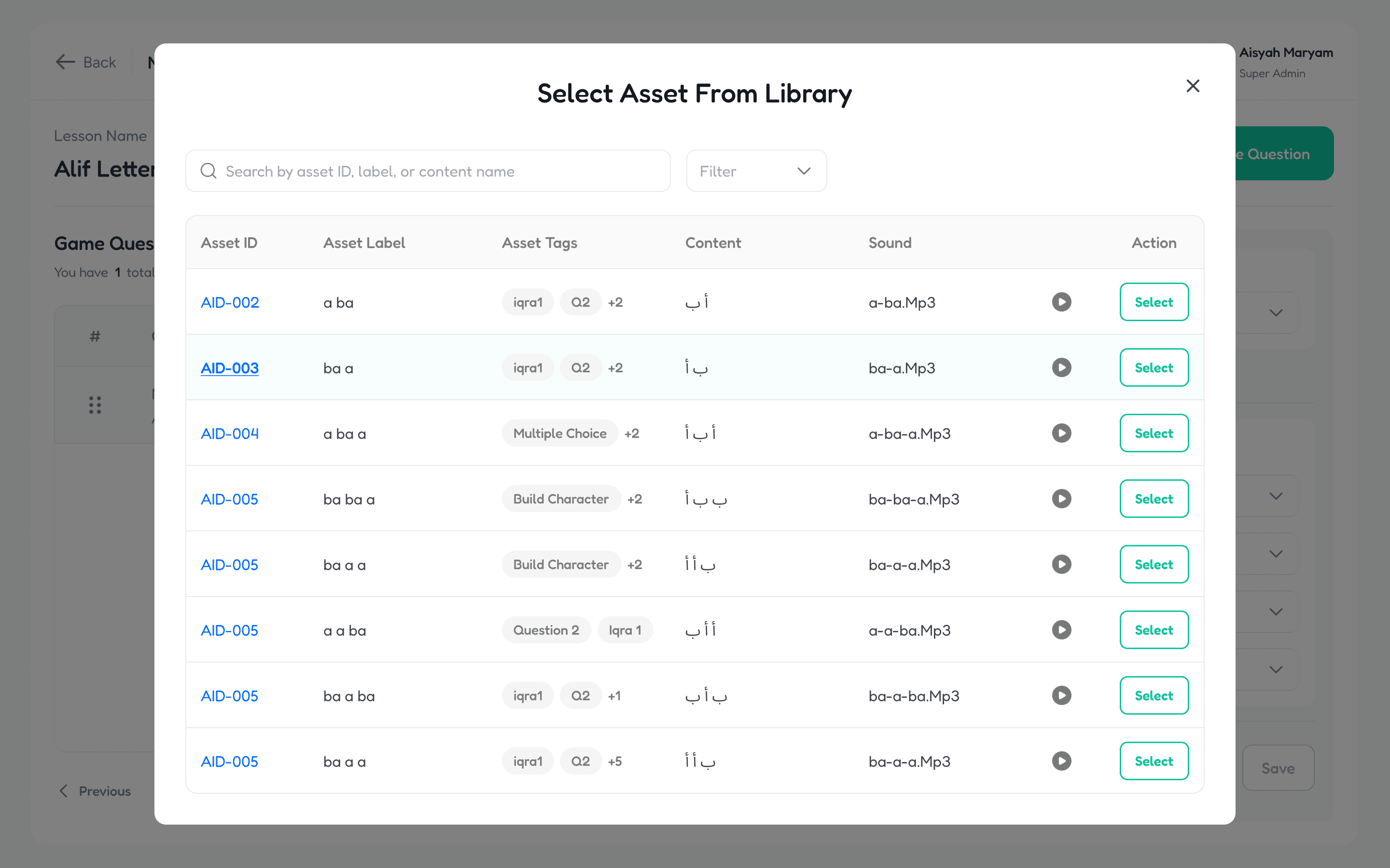
Select an asset from library : Asset Library acts as a universal selection modal. Asset ID, label, tags, content preview, and audio playback are all surfaced. Tags surface multiple potential roles, and the role gets assigned by the quiz builder context.
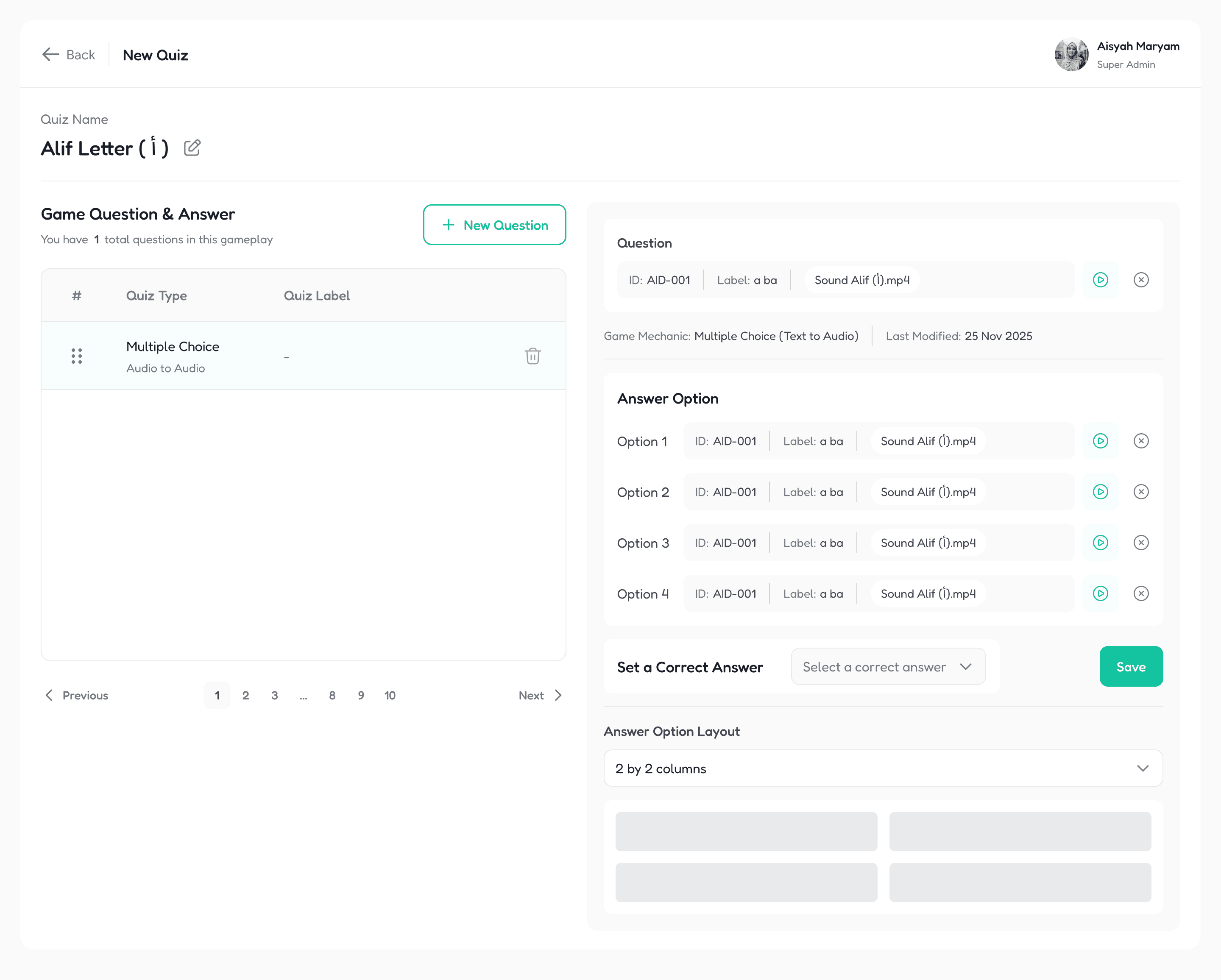
A new quiz arranged : Quiz builder in filled state. The same asset architecture supports text to audio, audio to audio, and image based mechanics. Layout switches between 2×2 columns and short-text variations based on content type.
Learn Mode Builder
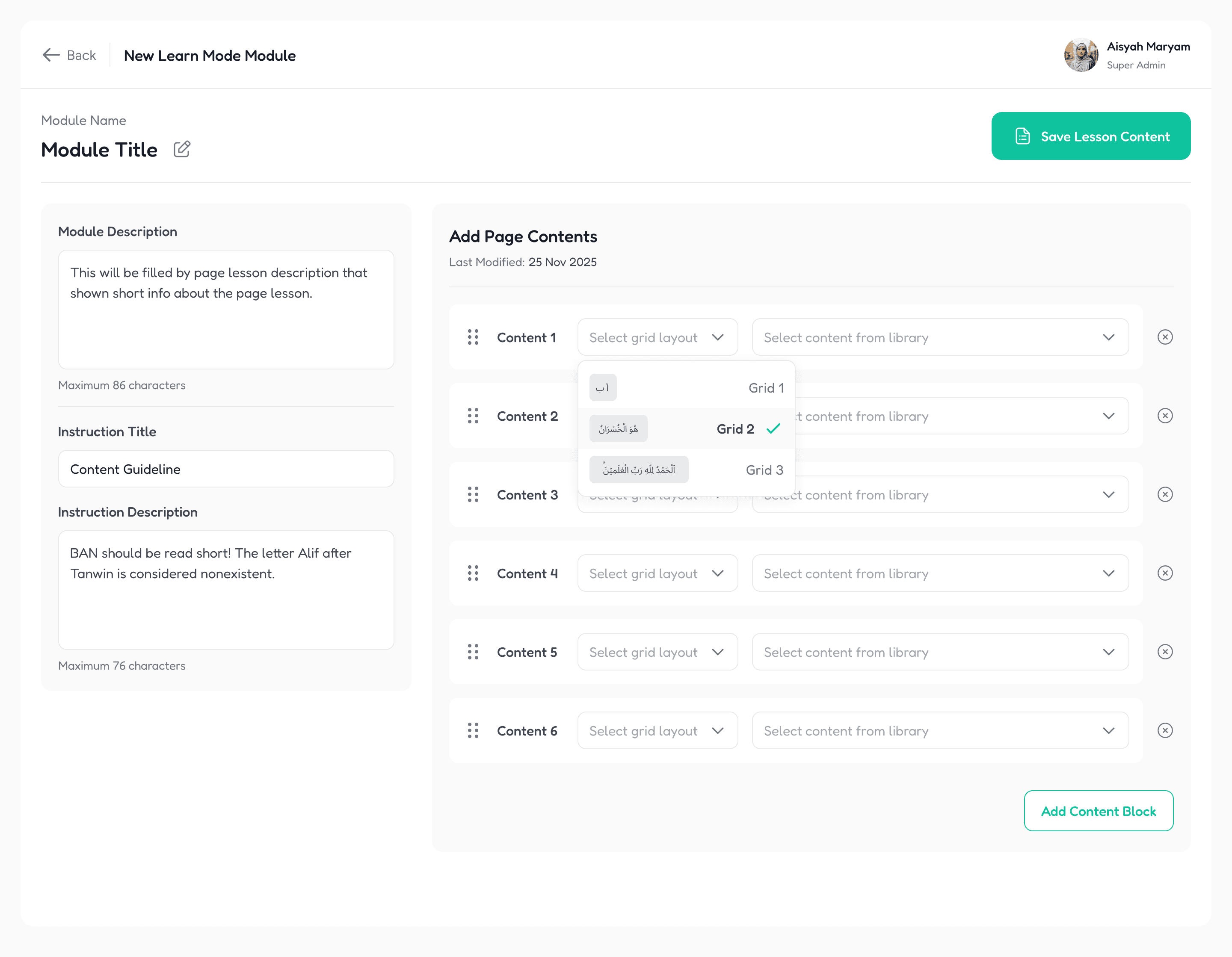
Learn Mode CMS : Learn Mode Module builder. The three-grid block system is exposed as a dropdown with live preview. Module description and instruction copy are capped at character limits to enforce content discipline.
05 - The Web Landing Pages
Three pages. Three audiences. Two build environments. One deadline.
Two weeks before launch, the scope expanded. Nurri needed not one landing page, but three. A main marketing page for parents discovering the app. An affiliate program page for influencers and educators promoting the app. And a sales page for converting trial users to paid subscribers.
Each page targets a different audience with a different conversion goal. Each one needed its own narrative architecture.
Main Landing Page
The framing came from product positioning sessions. Don't sell the app, address the parent's emotional state. Muslim parents are not searching for "another educational app." They are searching for peace of mind about screen time. They are searching for a way to feel proud of what their child is doing on a tablet. The page opens with a question that names their pain: "Does Your Heart Ache Seeing Your Child Lost in Screens?"
Below that, the page walks through data on the screen time problem, the story of Iqra in modern faith learning, parent testimonials, how the app works, and pricing. Every section converts emotion into evidence and back to action.
Affiliate Page
Different audience entirely. Affiliates are looking for income opportunity wrapped in mission. The page leads with "Be the Change for Muslim Families." The structure walks them through modern parent struggles, the opportunity (25% recurring commission, residual income, legacy framing), and a five-step onboarding flow. Clear identity for affiliates. Change ambassadors, not just promoters.
Sales Page for Every Registered Affiliator
Conversion-focused. Free trial offer, parent testimonials, comparison table against generic kids apps, FAQ addressing the specific objections trial users have. Available in both English and Bahasa Melayu, because the Malaysian market reads both fluently, and the language choice on the page is itself a trust signal.
Execution
How I shipped three landing pages in two weeks
I built the main and affiliate pages directly in Framer, mirroring my Figma design system as Framer variables. Full responsive treatment, light theme optimized for Muslim parents browsing during work breaks or after Maghrib. The sales page was handed off as a Figma design for the dev team to code in React, because it lived inside the product's web subdomain rather than the marketing site.
One designer, three pages, two build environments, end-to-end. This is the kind of scope that breaks designers who haven't built their own component systems. Mine held because I'd invested in the design system from week one.
06 - Key Design Decisions
Every real decision has something you gave up. Here are the three that defined this product.
Most of the design work on Nurri was clear problem solving. These three decisions required real deliberation. Each one had a valid competing option I considered and rejected.
Decision 1 - Typography
Uthmanic Script HAFS over Freedoka
Situation
My initial type pairing used Freedoka for English display. A fun, rounded font that would make Nurri instantly distinctive for kids. The CTO pushed back. Pairing playful with sacred created tonal whiplash for the Arabic content.
What I Gave Up
A more distinctive visual personality at the headline level. Some of the immediate kid-appeal of bright, rounded display fonts.
What I Gained
A type system that respects Quranic content as the anchor, with Latin fonts in supporting roles. The brand can speak to children today and not feel out of place serving adults tomorrow. Trust with religiously-attuned parents is non-negotiable. Lose that and the app dies on first impression.
Decision 2 - Visual Tone
Clean modern over kid-loud cartoon aesthetic
Situation
The Islamic kids app category is dominated by cartoon-heavy, primary-color-saturated interfaces. The easy path was to follow the genre. The product team initially wanted to lean harder into "fun" for children.
What I Choose
Restraint. Clean lists, white space, illustrated banners and mascot moments used surgically rather than spread everywhere. Color and shape applied with semantic intent in game mechanics, not decoration.
Why This Won
Nurri's roadmap extends far beyond V1.0. A multi-app ecosystem covering Solat, Sirah, Akhlaq, Daily Duas, and more is coming. A teen and adult product layer is on the roadmap. Designing V1.0 as a cartoon-heavy kids app would have forced a complete rebrand in 18 months. Restraint at the start is what makes scale possible later.
Decision 3 - INFORMATION ARCHITECTURE
Asset as entity over asset as file
Situation
My first admin panel design treated assets like files in a library. The CTO pointed out that an asset's role (question vs answer) is determined contextually, not at creation. My design didn't reflect this.
What Changed
I rebuilt the entire content authoring flow around the principle that role is determined at usage, not at creation. The same asset can be a question in one quiz and an answer in another. The library stores raw assets. The quiz builder assigns role.
Why This Matter
Content admins build hundreds of quiz items. The wrong abstraction would have forced them to create duplicate assets every time they needed the same letter in a different role. The right abstraction made the system scale from dozens of assets to thousands without operational friction.
07 - Constraints and Battle Story
Solo designer. Four surfaces. Six weeks. And the retrospective that saved the launch.
The hardest constraint wasn't the timeline. It was the scope inside the timeline.
Mobile app. Admin panel. Three landing pages. Plus all the supporting work that wasn't officially in my role. Illustration assets, animation specs for mascot moments, marketing thumbnails for the influencer campaign, twibbon templates for the launch live stream. Solo designer, broad ownership, weekly sprint reviews.
The breaking point
Around week four, I was working through every available hour. Revisions were stacking. Tasks were getting handled but not always documented. The PM noticed. My ClickUp board wasn't keeping up with my actual delivery, which made it hard for the team to track progress and for me to defend my workload.
The sprint retrospective
I raised it directly in the next sprint retrospective. Not as a complaint, but as a system problem. I named what I was actually handling, namely design across four surfaces plus illustration and animation work outside my role. Then I proposed a working agreement. I'd commit to faster review cycles and tighter design delivery. The PM would commit to creating task tickets on my behalf when new work came in so I didn't have to context-switch into project management.
The team accepted it. It worked. By the final two weeks before launch, the system was running cleanly. Task creation handled by PM, design delivery on time, review cycles fast.
👋🏻 me, on owning your workload as a solo designer
"Solo designers don't fail because they can't design fast enough. They fail because the operational overhead, the documentation, ticket management, and status updates, eats the hours that should go into the actual craft. Push back early, build the support system you need, and protect your design hours like they're the only thing you have. Because in week six, they are."
Demo day Google Meet : Usability is a critical issue, so we did a usability across internal team after 2 sprints or before every depoyment.
I used to keep what I've to protect after demo and its revisions. Here the samples:
What I let go
✕
A more elaborate first version of game mechanics. The CTO repeatedly pulled my complexity down to match ShadCN component availability in admin and React Native equivalents in mobile
✕
Some Framer interaction polish on the landing pages. Responsive correctness was prioritized over delight
✕
A more thorough design QA pass on edge cases. Post-launch, this surfaced as bugs
What I protected
✓
The design system foundation. Every component referenced tokens, no hardcoded values
✓
The Uthmanic typography integration. Spacing rules manually tuned despite the volume of work
✓
Brand consistency across mobile, admin, and web. One visual language, zero divergence
The CTO complained more than once that my designs were too complex. He was right every time. Each complaint forced me to find the simpler version that delivered the same user value with less engineering cost. By week six, my Figma instinct had recalibrated. I was designing for what could ship, not what would look best in a Dribbble shot.
08 - Outcomes
Live in both stores. Growing without ads. And a roadmap the team is already building toward.
Live since January 2026
V1.0 shipped to App Store and Play Store mid-January. V1.2.3 currently live. Active user growth is driven primarily by organic word-of-mouth and one influencer campaign. The affiliate program is live with 160+ affiliates promoting the app across Malaysia.
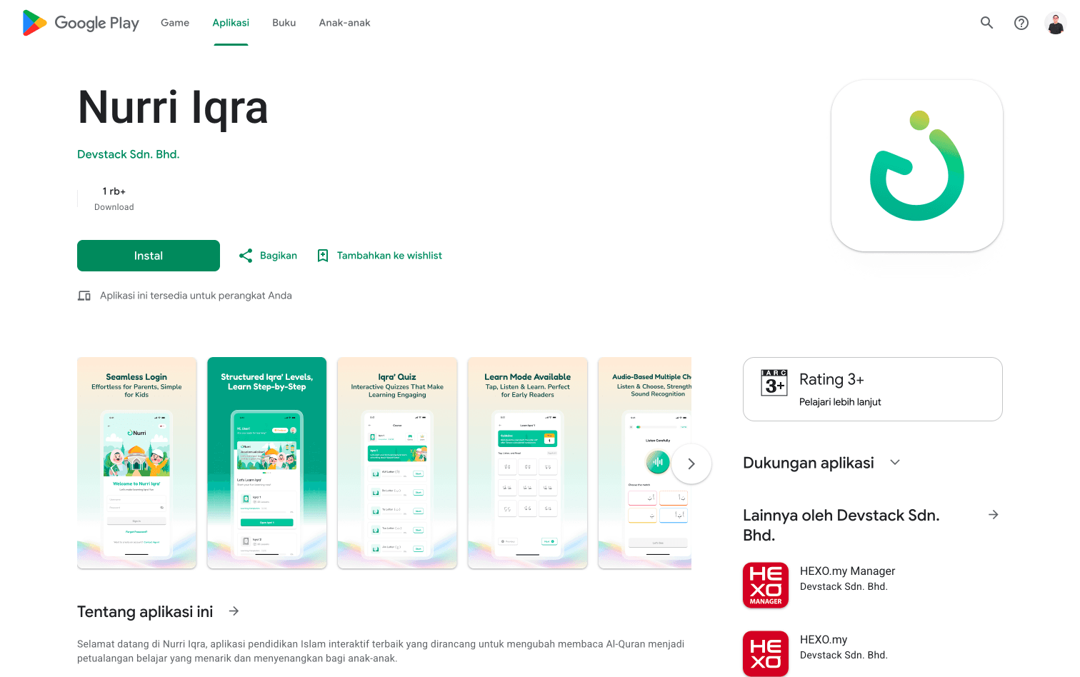
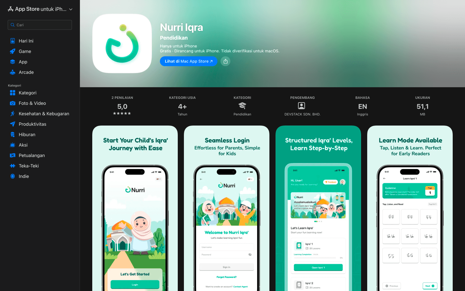
App Store and Play Store listings : Side by side of the App Store and Play Store listing pages showing the screenshots, app icon, description, and rating.
Influencer campaign with Izzhar Nazri
We partnered with Malaysian TikTok creator @izzharnazri.plus for the launch campaign. I designed the campaign assets including thumbnail posts, twibbon templates for the live stream, and branded content for cross-posting. The campaign drove the initial subscriber surge.
Multi-app ecosystem confirmed
Nurri V1.0 is the anchor product in a larger ecosystem play. The product roadmap includes horizontal expansion into Bahasa Melayu, Daily Duas, Akhlaq stories, Solat, Sirah, and more. All sharing the design system, mascot, and parent dashboard. My V1.0 design decisions were sized for this scale from the start.
What users are telling us
The feedback that matters most is qualitative. Parents are using the app. Children are returning. The product loop is working.
THE FEEDBACKS
What parents love
The ad-free experience, the visible progress tracking, the gamified engagement that makes children request the app instead of resist it. The 7-day free trial converts at a rate that surprised the team.
What needs work
In-app purchase for children's apps is regulated differently from standard apps. Subscriptions currently require manual handling, which creates friction. This is a known constraint we're solving in V2. Bug reports include some visual state issues (a teal completion banner unexpectedly turning red when transitioning between Iqra volumes), which surfaced because the design QA pass got compressed in the final week.
What parents are asking for
More content, more game mechanics, faster expansion. This is the best kind of feedback. Users not asking for new features means users don't care. Users asking for new features means we built something they want.
09 - Reflection
What I'd change. What worked. What I carry forward.
Six weeks. One designer. A product born from a project that didn't ship. Now it's live, growing, and asking for V2.
What I'd do differently
Pull development constraints into design earlier
The CTO's repeated push to simplify my designs cost iteration time that better upfront alignment could have prevented. Next project, I'm starting every major feature with a 15-minute call to align on what's feasible in the codebase before opening Figma. Design system decisions made without implementation reality become design debt the moment you ship.
Build the design QA gate into the timeline
The bug reports we're now triaging in V1.2.3 (the teal-to-red banner state issue, a few edge cases in the learn mode flow) were preventable. They surfaced because the final week prioritized launch readiness over edge case testing. Next time, I'm carving out two days for design QA before launch, not after.
Document the design system as it's built, not after
Because I built the system fast and shipped it across four surfaces, the documentation lived in my head. When new content admins or future designers need to extend it, the lift will be heavier than necessary. The next system gets documentation written alongside the components, not retrofitted.
What worked better than expected
The trust I built with the CTO through fast iteration
I shipped designs the moment a sprint task was complete and requested review immediately, rather than batching reviews at sprint end. This kept the dev team unblocked and built a feedback loop where my designs got better with every cycle. The PM and CTO both flagged this in retrospectives as a force multiplier for the team's velocity.
Owning illustration and animation specs alongside UI
Most product designers stop at the UI handoff and let illustration and animation be someone else's problem. Because Nurri had no one else, I owned it. The mascot moments, the celebration animations, the empty state illustrations were all my work. This expanded my own design vocabulary in ways I didn't expect.
Designing the brand to outgrow the product
The decision to build a clean, modern visual language instead of a kid-loud cartoon aesthetic gave Nurri the ability to expand into adjacent products without rebrand. As the multi-app ecosystem rolls out over the next 18 months, every product will inherit this foundation.
Principles I carry forward
Strategic leverage beats fresh starts
Six weeks shipped Nurri because we used what we already knew. Greenfield design is overrated. The best work happens when constrained knowledge meets fresh ambition.
Designing for kids requires more restraint, not less
The instinct in children's products is to add. More color, more cartoon, more decoration. The harder discipline is to subtract until only what serves the child remains. Restraint scales. Loudness doesn't.
The right interface is the one the backend can support
Design rejected for logic reasons isn't a defeat. It's the moment to learn the system deeply enough to design the right surface for it. Every "logic doesn't work" rejection on Nurri made me a better systems thinker.
BACK TO ALL WORKS
🔥 FEATURED
Product Design • Mobile App • EdTech • Gamification • 2026
From a cancelled project to two app stores in six weeks

ROLE
Solo Product Designer
timeline
6 Weeks to V1.0 Now shipping V1.2.3
Collaboration
1 CTO, 1 PM, 1 QA, 1 Lead Developer, 4 Engineers
Ownership
End to end ownership from logo to launch, including illustration
Go to top
Go to top