01 - Context & Problem
Real users, real feedback, no designer
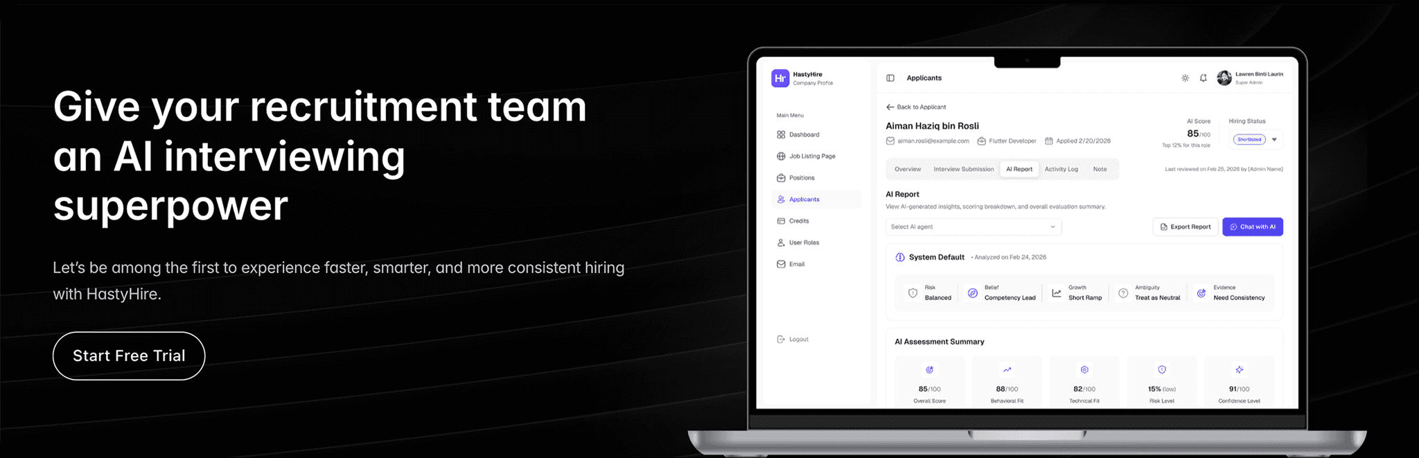
HastyHire is a multi-tenant SaaS platform that automates hiring through AI powered video interviews. Companies post positions, candidates record responses via a public link, and seven AI agents analyse each submission and generate a detailed hiring report.
When I joined, the product was already live with paying clients. Three recruitment campaigns had been completed. The entire UI had been built by developers and it worked, but it wasn't designed. More critically, the client team had documented exactly what was wrong.
Client feedback, documented from 3 live campaigns
"The WYSIWYG is too small. Can't see which candidates I've already reviewed. Not clear when credits were used. How do I close a position for new submissions?"
HastyHire Meeting With CTO : In this session the CTO, PM, Full-Stack, and me were discussing about all the feedbacks from client which are urgent to be executed following with UI improvement as soon as possible.
So, here some of the feedbacks that we discussed above:
Urgent - Must Have (Blockers)
•
WYSIWYG too small for real job descriptions
•
No way to track which candidates were reviewed
•
Can't set candidate status (rejected / shortlist)
•
Credit consumption unclear
•
No way to close a position for submissions
•
Can't see question text without opening each video
•
Improve UI visual and adjust clear UX for position, applicant, and job listing page.
Nice to Have (Friction)
•
Dashboard widgets not clickable
•
AI report scroll-within-scroll layout
•
Wrong date format (mm/dd/yyyy)
•
AI analysis too generic for the role
•
Position status misaligned with applicant status
•
No shareable interview, only link
•
Can't edit existing email that already set before
•
Can't manage hiring pipeline stages
I treated the client feedback document as the primary brief. Everything I designed was traceable back to a specific item in that list.
02 - Design System & Landing Page
Design system first. Landing page second. Dashboard third.
The brief was simple: HastyHire needed a landing page. No reference, no existing brand, no design system. Before I opened Figma, I made one decision that shaped everything that came after, so I would build the design system first, not the screens.
That meant setting up semantic colour tokens, typography scale, spacing variables, and component variants in Figma which all wired to light and dark mode natively. Only after the system was documented, I start designing the landing page. Then I developed it directly in Framer, mirroring the Figma token structure as Framer variables so both environments stayed in sync.
And here we go for the design system. Actually This wasn't bureaucracy. It was the only way to make both surfaces sustainable and visually coherent without having to maintain two separate design directions.
First, I setup Design System in Figma

Design System in Figma : Semantic colour tokens, typography scale, spacing variables, component variants which all connected to light/dark mode via Figma variables.
Next, I Create Landing Page Design in Figma
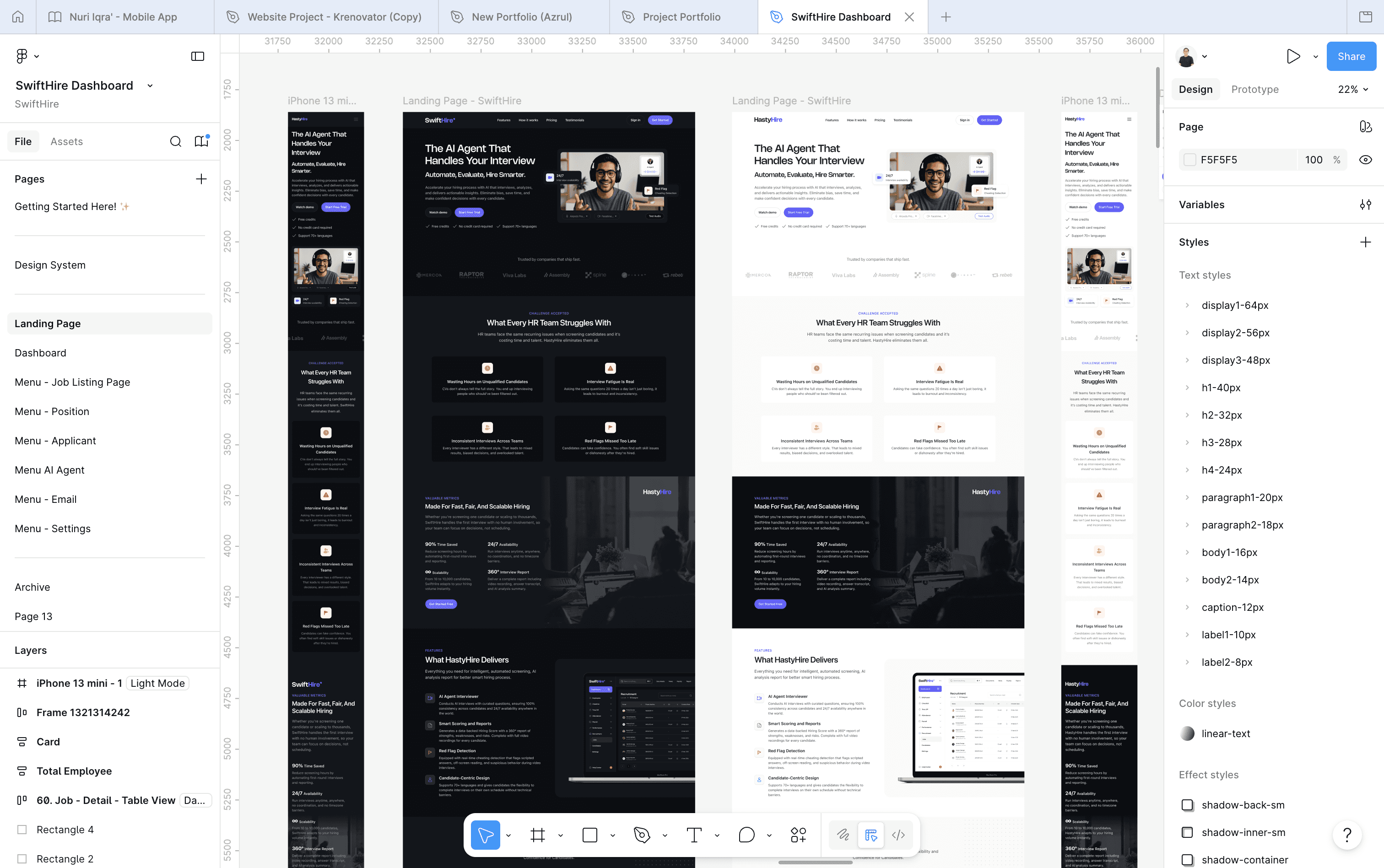
Landing Page Design in Figma : Full page layout built on the token system. Dark mode variant generated automatically from the same components.
Developed in Framer

Framer Develop : Variables connected to Figma and it has light & dark theme with toggle switch. Also here I create a custom component code that can switch between two different images when changing across light and dark theme. (This landing page preview is after post-launched V2.0 completed)
Shipped to Production (Version 1.0)
Then the second brief arrived
03 - The Work
Six surfaces, one visual language
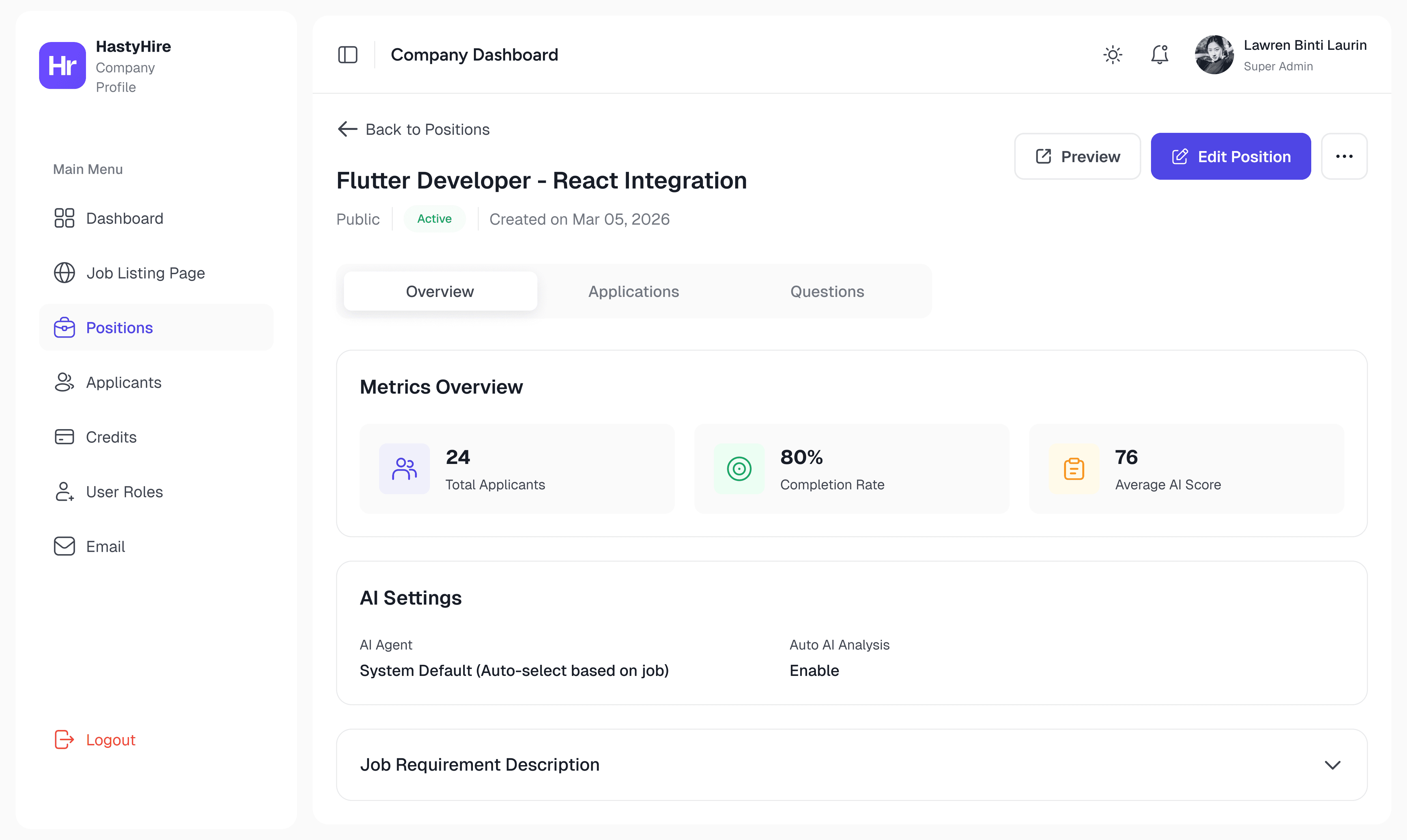
Dashboard
Stat cards → navigable shortcuts with growth context
Must Have
Before
Static cards. Clicking them did nothing. Explicitly flagged in client feedback.
After
Each card navigates to its section + shows growth delta (+3.14%). A metric that goes nowhere is a dead end.
Static text → onboarding checklist with progress state
UX Improvement
Before
Three plain text items. No state, no interaction, no progress.
After
Step-by-step checklist with completion tracking. Converts an empty state into momentum — users know exactly what to do next.
No chart → Applicants vs Open Positions trend line
New Addition
Before
No visualisation. No sense of trend, velocity, or pipeline health.
After
Line chart with 1M/3M/1Y filter, interactive tooltip per date. Hiring managers think in pipelines — a chart communicates what a number can't.

HastyHire Dashboard : This is a live preview before redesign. It looks so simple and the clients don't like it, so they request to upgrade the UI but still clean and simple without much data.
Iteration - what I designed first was wrong
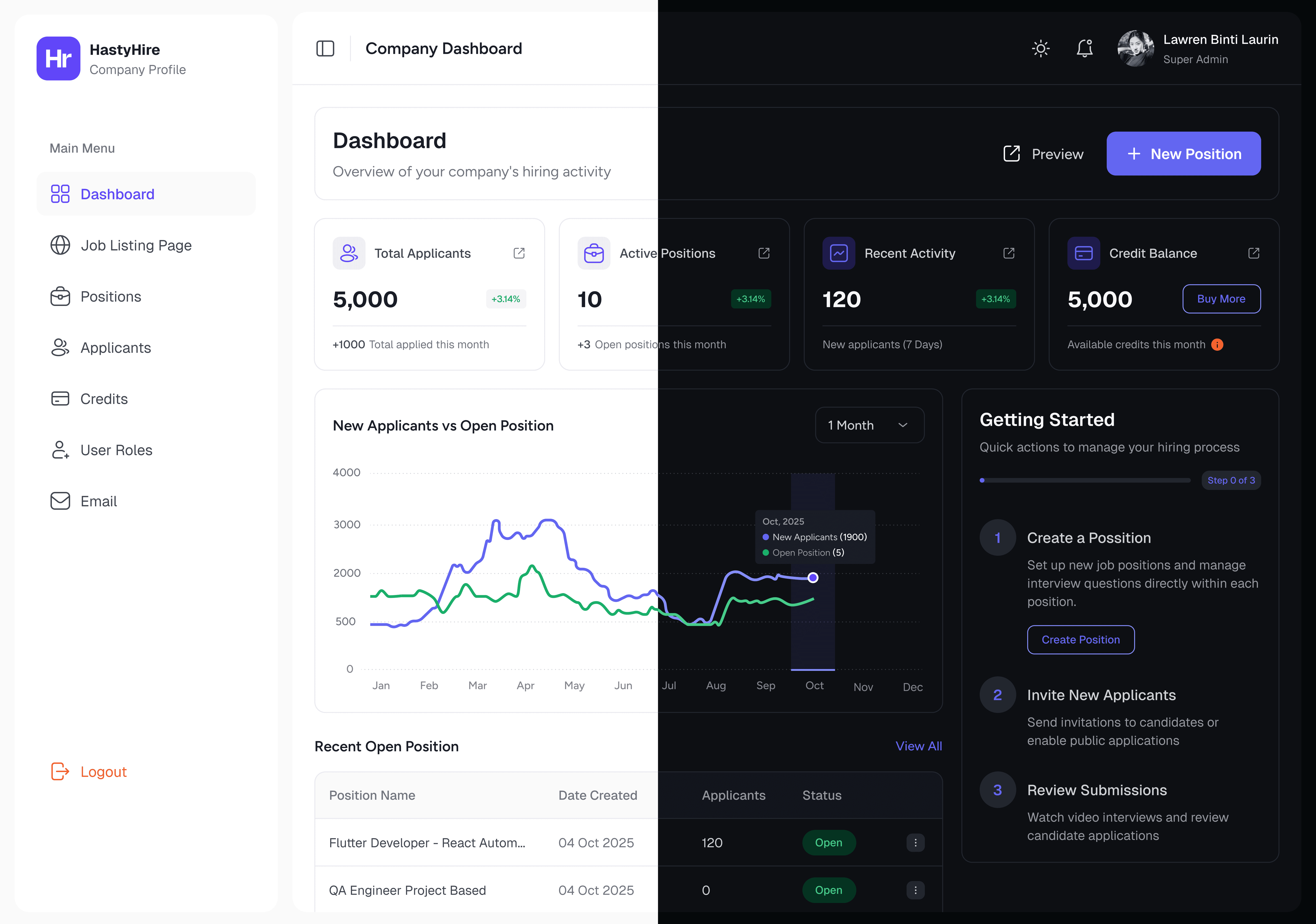
HastyHire New Dashboard : This is a a redesign result that keeps clean and not too much data.
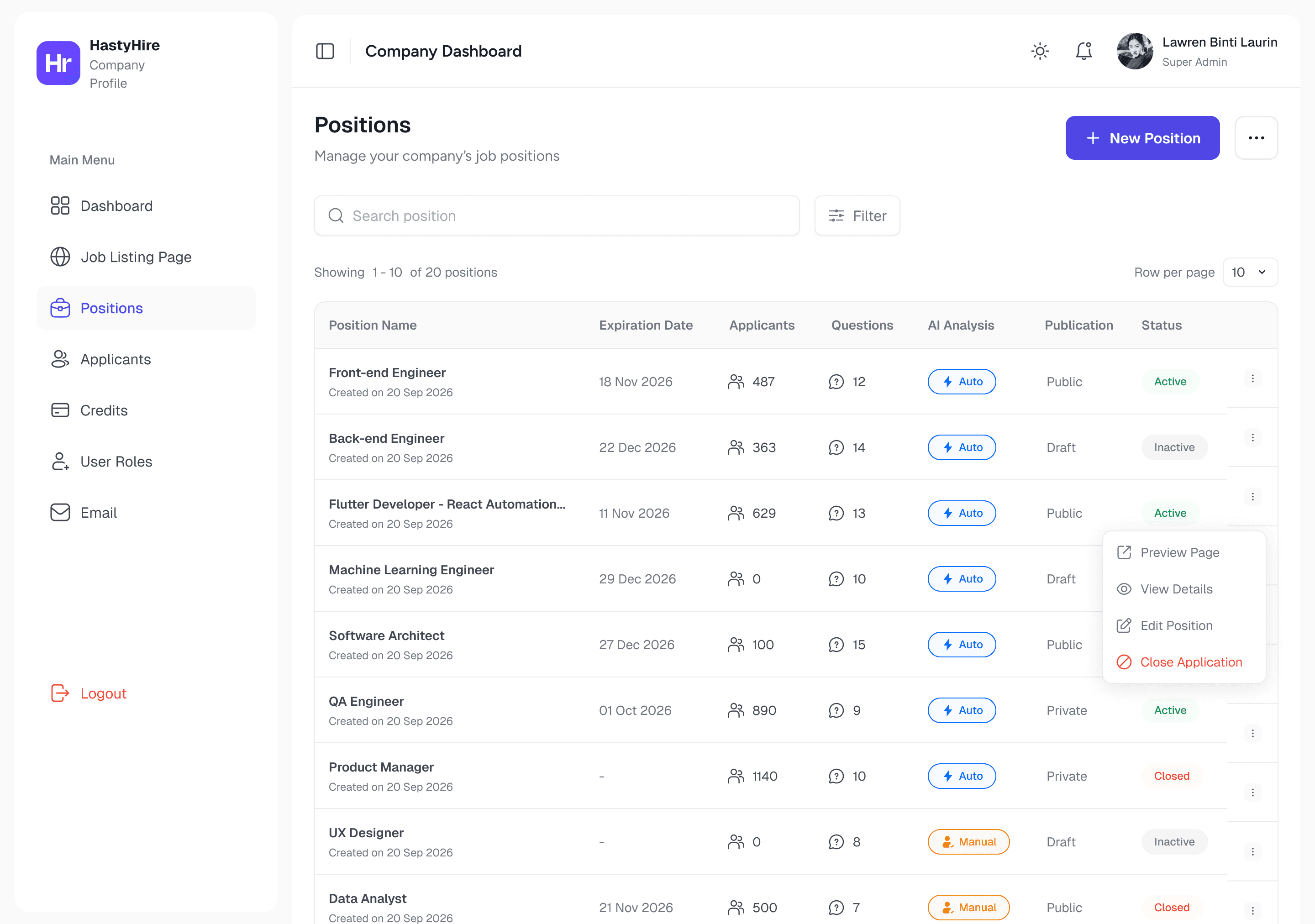
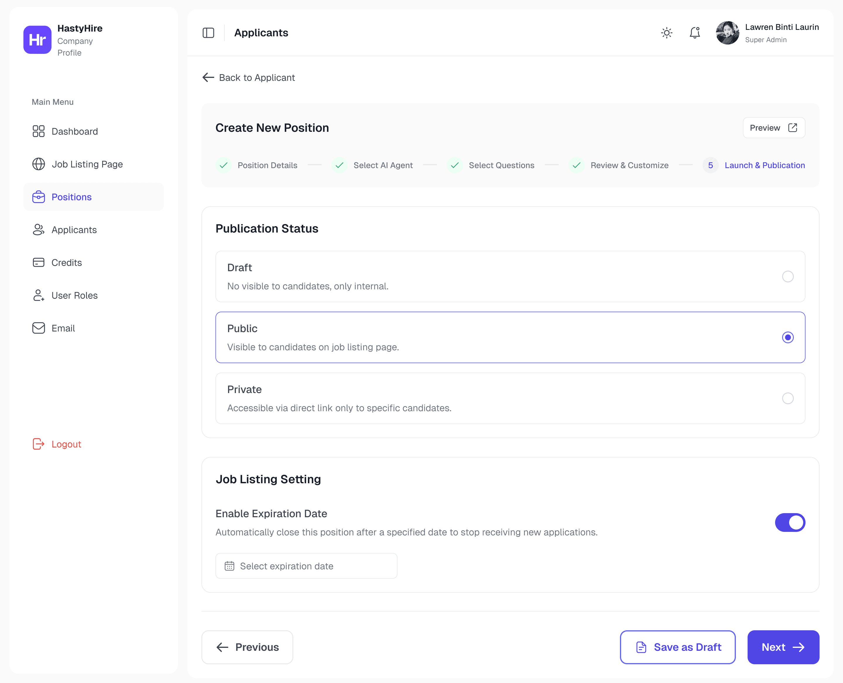
Position
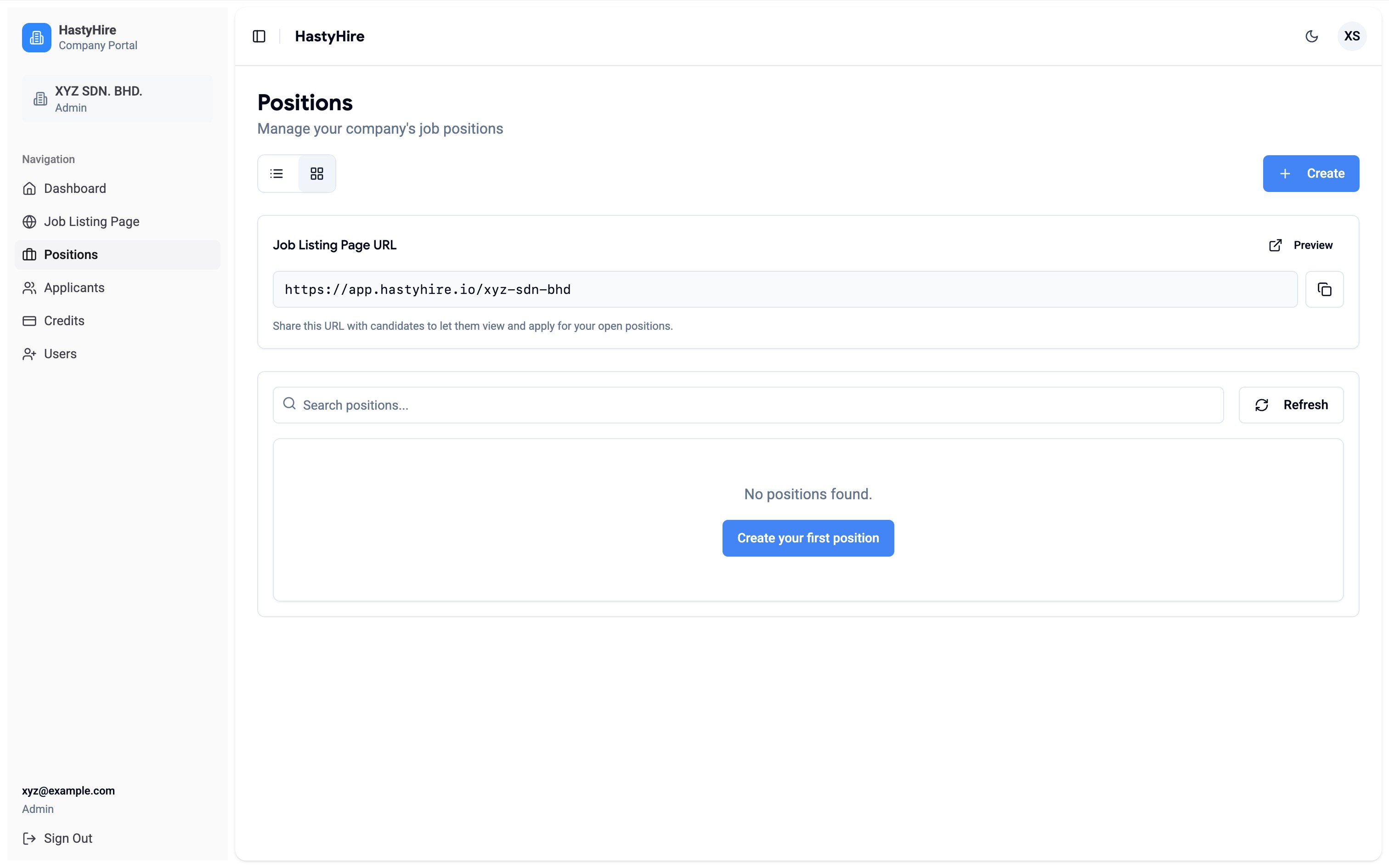
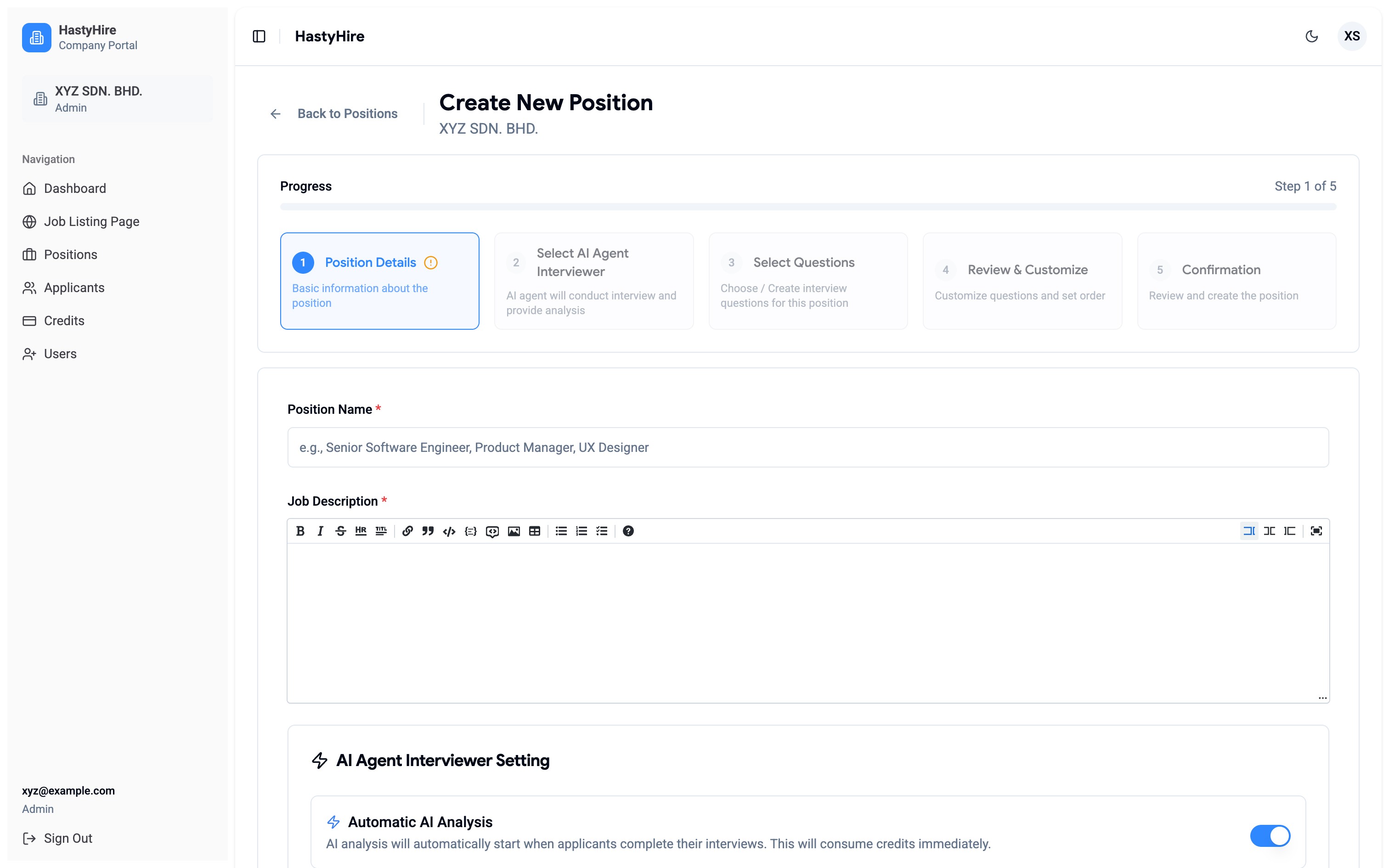
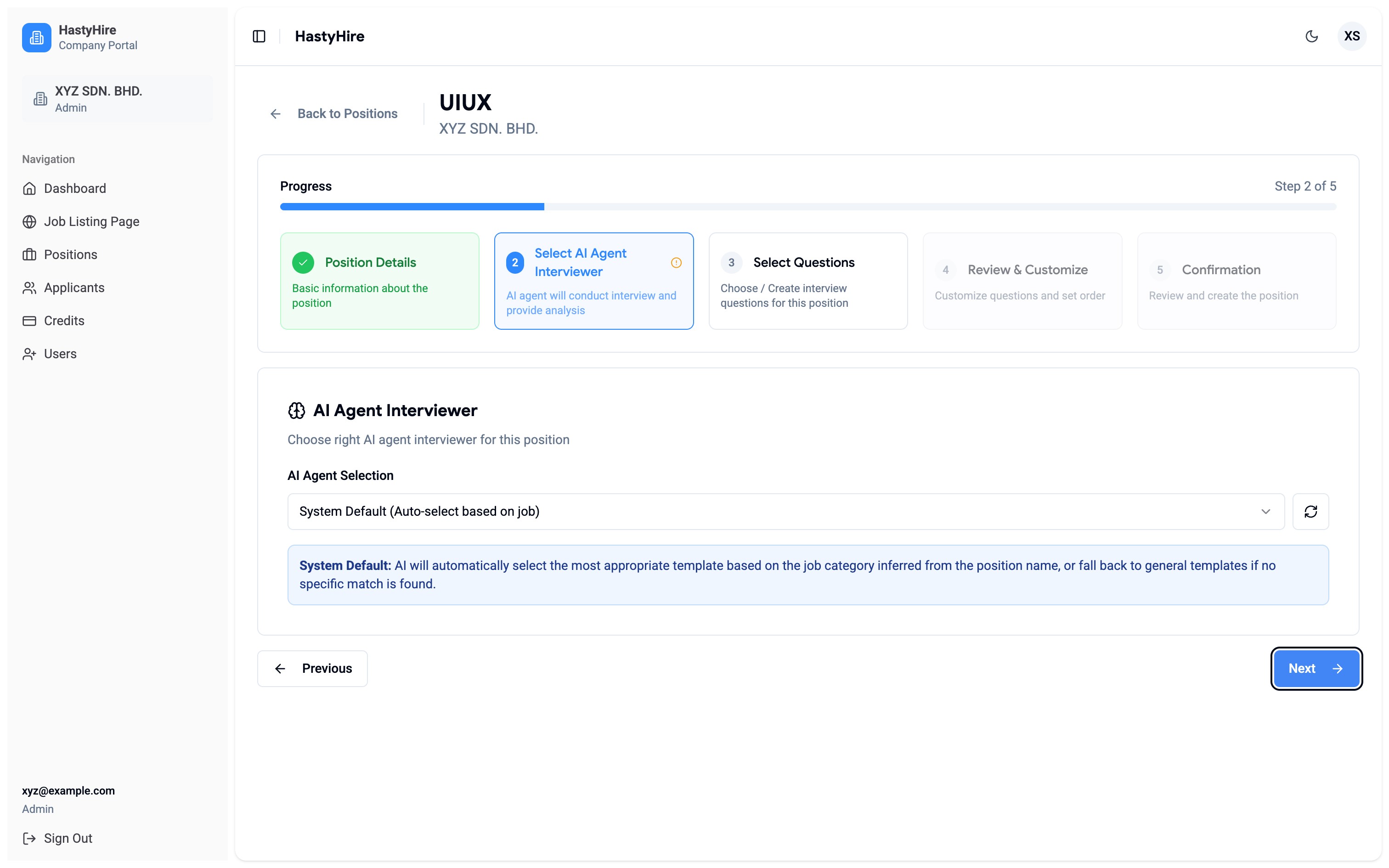
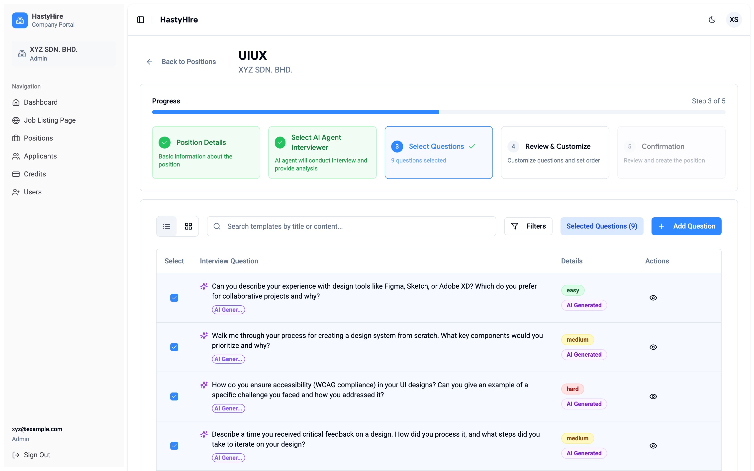
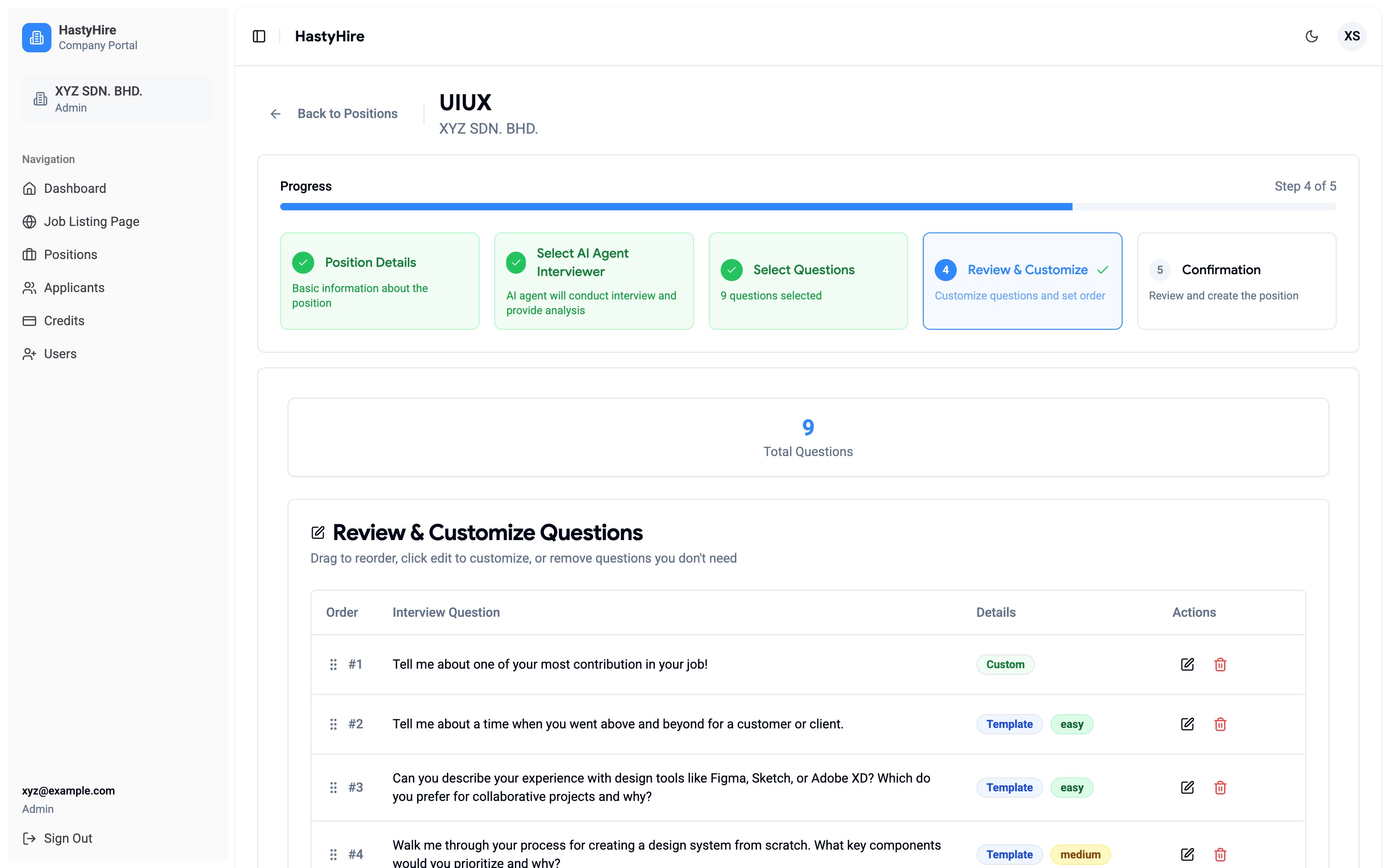

Step 5 (Launch & Publication) was the direct answer to: "How do I close a position for new submissions?" . This step actually want to introducing Draft/Public/Private visibility, expiration date with auto-close, and a maximum applicant cap, but there are no functions inside.
Iteration - two things I got wrong here
HastyHire New Dashboard : This is a a redesign result that keeps clean and not too much data.


Applicants


04 - KEY DESIGN DECISIONS
The choices that weren't obvious
Most of the work was clear problem solving. These three decisions required genuine deliberation where each of it had a valid competing option I considered and rejected.
Decision 1
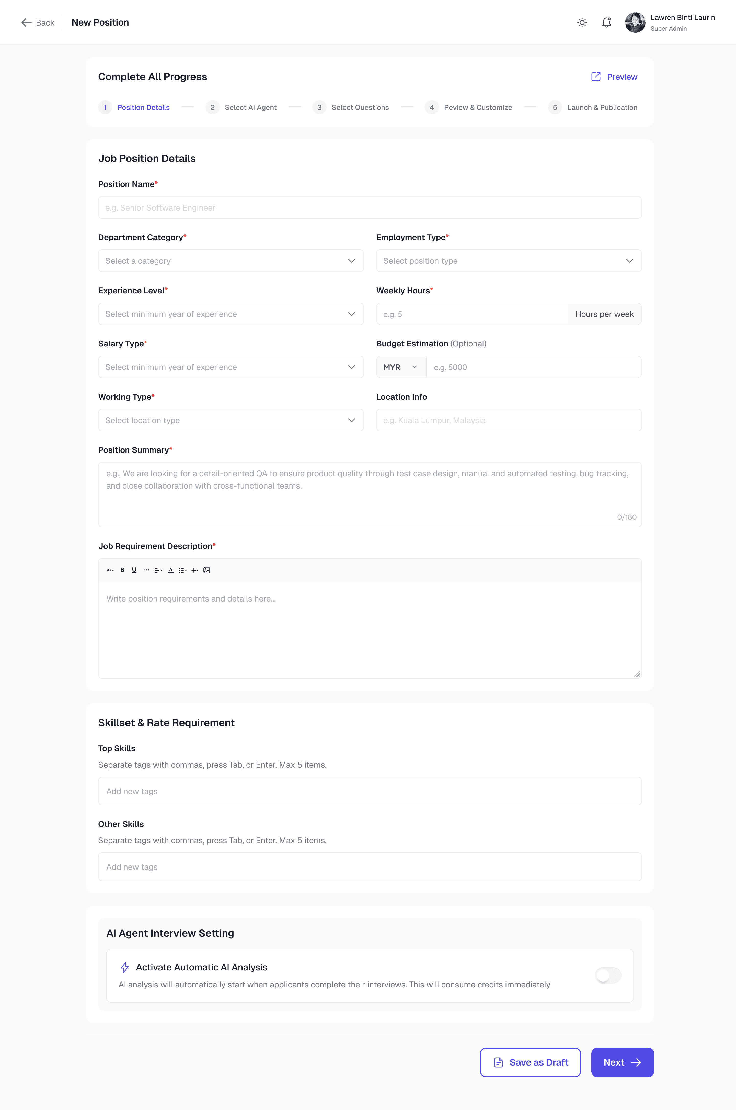
Wizard vs single long form for position creation
Situation
I could have kept the single page structure and just cleaned it up. Less dev work, simpler to implement. The wizard was a bigger change.
Why wizard won?
AI agent selection and question curation are different cognitive modes from filling a job description and they shouldn't share the same visual frame. More importantly, Step 5 (Launch & Publication) needed to feel consequential and separate. It's the moment the position becomes visible to candidates. Burying that decision in a long-form page would undermine its weight.
Decision 2
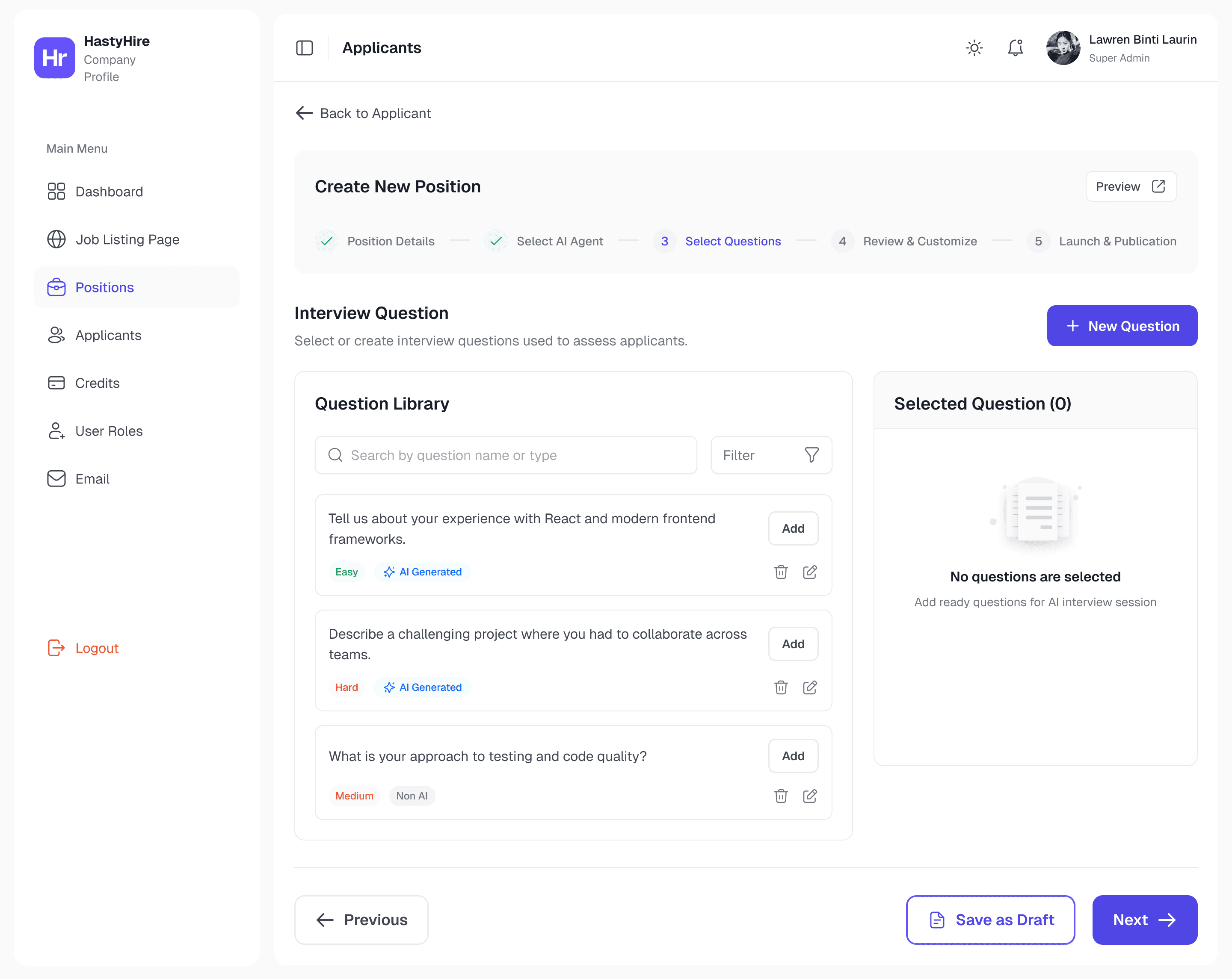
Question text at the list level, not just inside the video
Situation
The original put question text only inside the video player. The reasoning: questions are part of the video experience.
Why I moved it up?
A recruiter reviewing 40 applicants isn't watching videos sequentially and they're triaging. Question text at the list level is a triage tool. It lets recruiters decide which submissions to prioritise before committing to watching anything. Move context to where decisions are made, not where content is consumed.
Decision 3
How to display AI scores without over indexing on the number
Situation
The original showed "36/100" in an aggressive red badge and a single number, no interpretation.
So, How Do I Approach?
Three approaches: raw number only (false precision, decontextualised), category labels only (removes the number hiring managers need for ranking), and finally score + contextual label + colour. Three layers of the same information for three reading speeds: colour for fast scanning, number for comparison, label for human interpretation.
05 - Constraints & Tensions
Shipping fast for a team already in motion
The client was actively waiting. Dev was building new features in parallel. I was the only designer. No design reviews, no user research sessions, no comfortable discovery phase.
Azrul, on the first round of feedback
"My initial designs had too many new UI patterns. The CTO pushed back and the client needed the product usable fast. I had to find the highest impact UX improvements within what was technically feasible, not just what looked best."
What I let go
✕
Ambitious components that didn't exist in ShadCN
✕
User research before shipping
✕
First-round designs flagged as too many new patterns at once
What I protected
✓
Token based design system with non-negotiable foundation
✓
Dark mode from day one via architecture
✓
Every Must Have item from client's documented feedback
There was also a component debt problem mid-sprint. Some Figma components had no ShadCN counterpart. When flagged, I redesigned to use what existed except where the UX gap was significant enough to justify the new component. That negotiation happened several times and made me faster at distinguishing "design preference" from "user need."
06 - Outcomes
Shipped before deadline. Zero unresolved blockers.
All blockers addressed
Every Must Have from client feedback had a design solution such as WYSIWYG, candidate status, position closing, question visibility, credit clarity.
Dark mode at launch
Built into the token architecture from day one, not a separate feature. Shipped with zero additional design effort.
System extended by dev
Email and Settings built after my engagement. Its use the same tokens and components without my involvement.
No post-launch complaints
Client resumed campaigns on the redesigned product. The silence is the signal that they still enjoy all redesigned core features.
07 - Post-Launch: CEO Feedback & Landing Page v2.0
The page was live. Then the CEO sent feedback.
The landing page had been live for some time when the CEO called a short meeting. The feedback was direct and comprehensive with a detailed written guide covering every section of the page, with specific diagnosis, recommended rewrites, and visual hierarchy rules. Almost everything needed to change.
The core diagnosis: the page had strong raw ingredients but no single story. Multiple competing narratives such as "AI agent interviewer," "first interview automation," "fast and fair hiring," "smart screening" where were all present but never tied together into one coherent buyer journey. The result was a page that was informative but not persuasive.
What the CEO identified
What I’d What changed for every section
The redesign touched all 12 sections. The most significant changes:
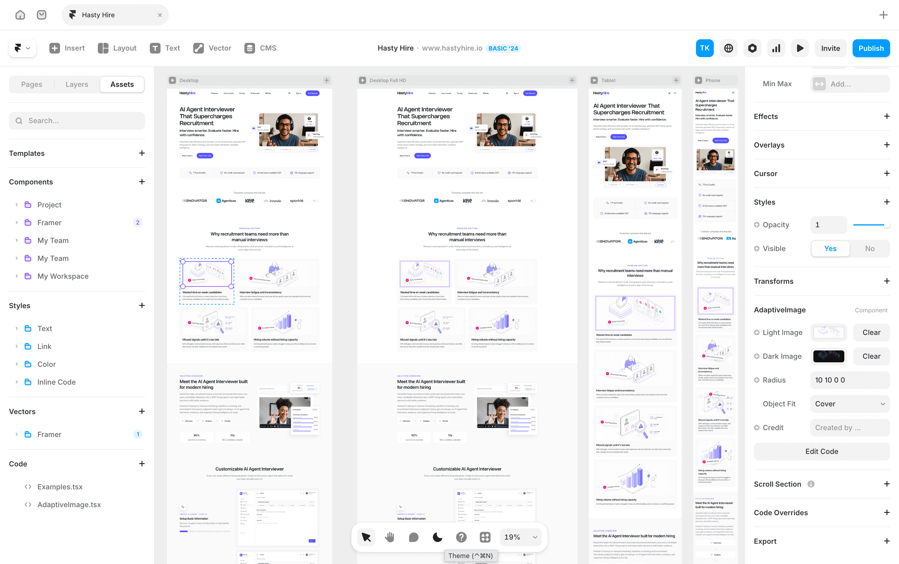
Hero Section: Rewritten and decluttered copy
Priority 1
Before
"The AI Agent That Handles Your Interview", This copy is too narrow, buried the broader product value. Crowded visual with competing interface fragments, badges, and CTA buttons all fighting for attention.
After
"AI Agent Interviewer That Supercharges Recruitment", The new copy looks broader positioning, one dominant visual, three concise trust bullets below the CTA. Calm and authoritative instead of overloaded.
Adding a new section for AI Agent Customization
Priority 2
Before
There is no AI Agent section that show how users can customize their AI with all requirements needed for every candidate interview report.
After
I redesigned AI agent flow in Figma that can show how users easily create their AI agent. After redesigning completed, I show it also as the main section before features section in HastyHire landing page.
Page structure must be reordered around buyer journey
priotity 2
Before
Sections appeared in a product-logic order, not a buyer-decision order. Pain points appeared too late. Trust signals were scattered.
After
New sequence: Hero → Trust bar → Problem → Solution → AI Agent Customization → Features → Workflow → Proof → Pricing → FAQ → Final CTA. Each section serves one stage of the buyer's decision journey.
FAQ must be expanded to address real buyer concerns
priotity 2
Before
FAQ covered setup and free trial. Missed the questions HR buyers actually have around trust, control, fairness, and candidate experience.
After
Reorganised into 4 groups: Product & use case / Trust & control / Candidate experience / Pricing & billing. Added questions like "Does HastyHire make the hiring decision for me?" and "Can candidates game the AI?"
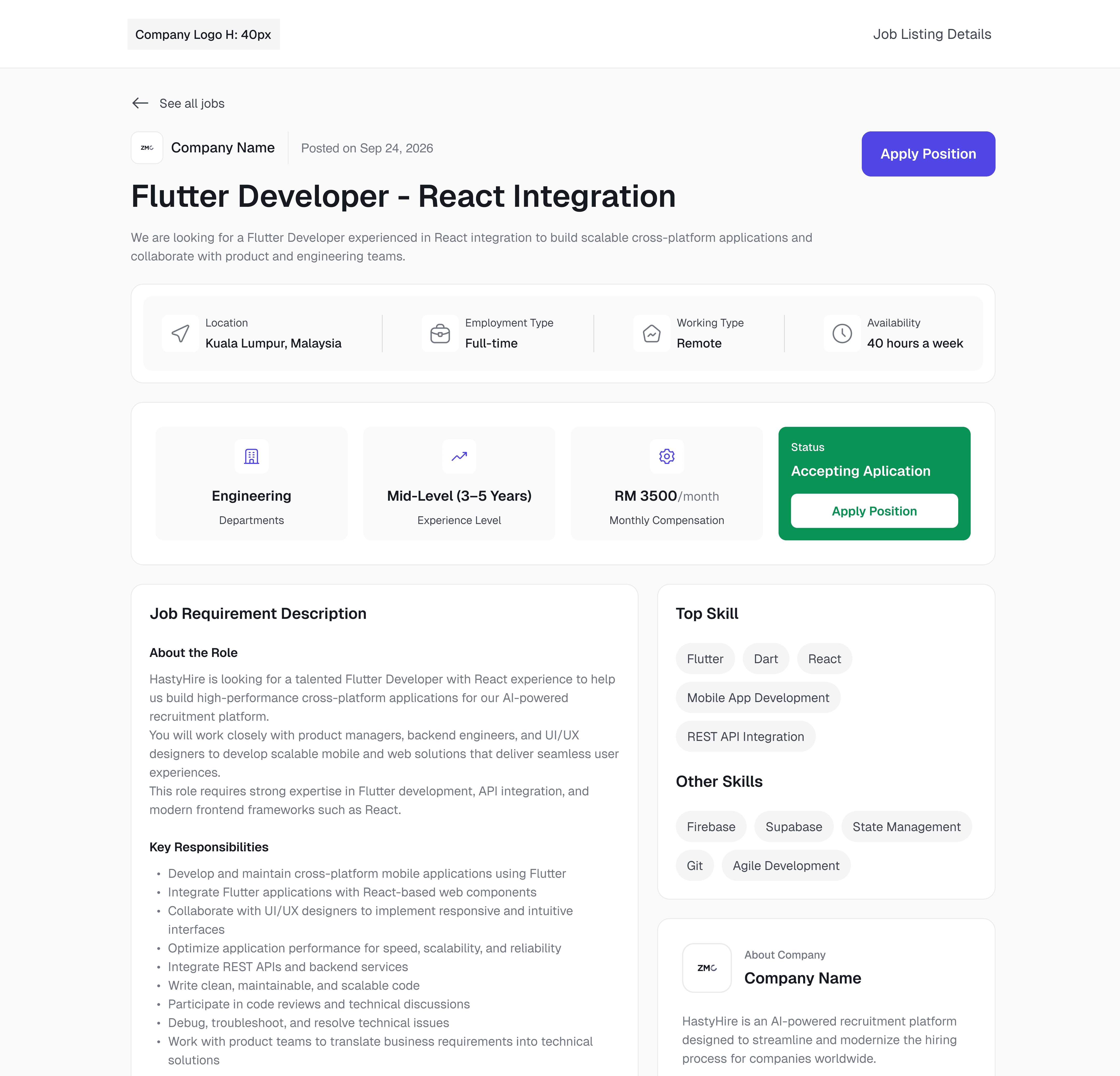
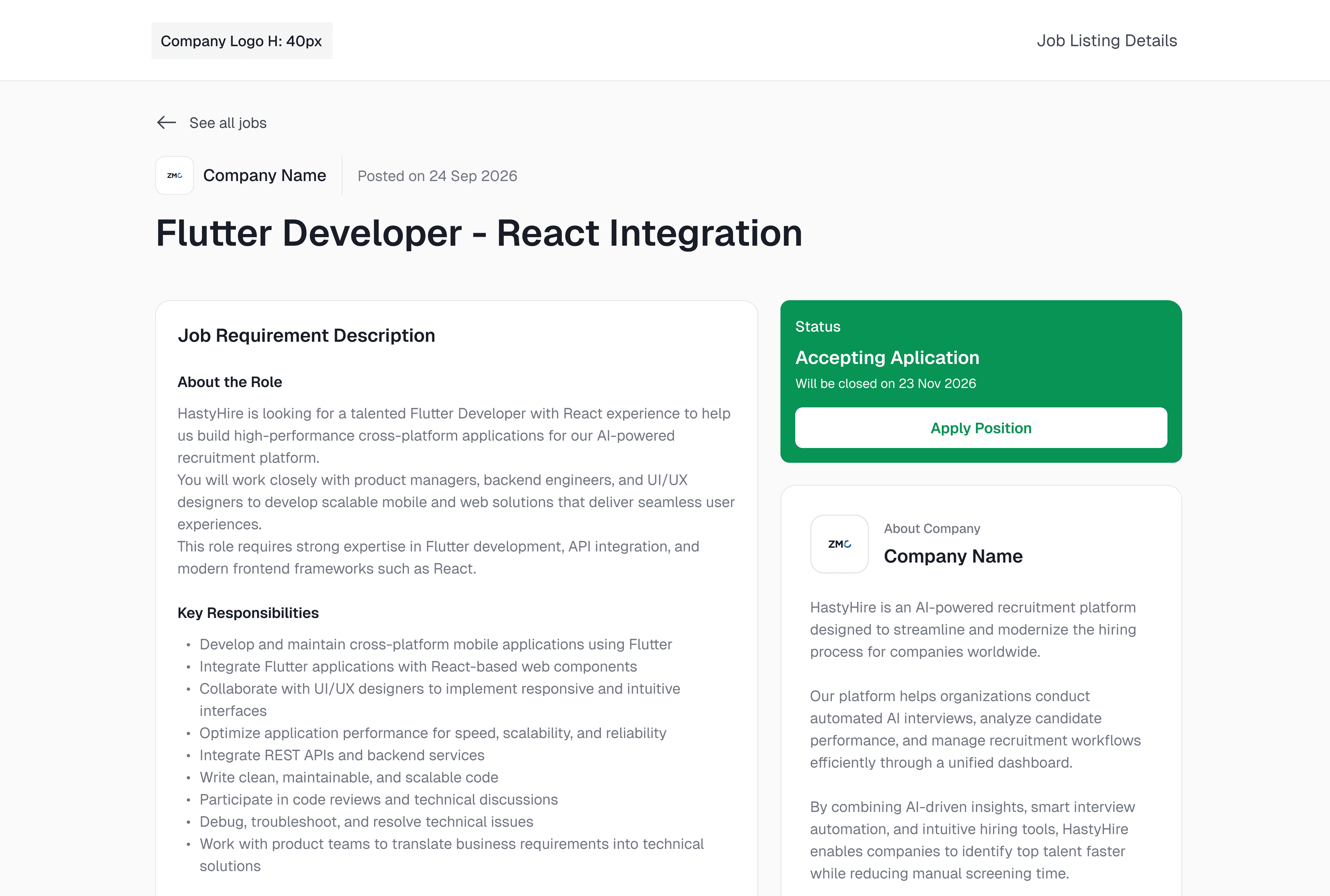
Illustrations & visuals rebuilt throughout
Full Redesign
Before
Decorative UI fragments and floating elements competed with headlines and CTAs. Screenshots didn't match the claims made in their sections.
After
Real product screens paired to each section's claim. Decorative elements removed. One dominant visual per section. Mobile-optimised with accordions, stacked cards, and swipeable pricing.
Final Approved - Post Launch V2.0 ✅
08 - Reflection
What a live product teaches you
Three months. One designer. A live product with real users. Here's what I'd do differently, what surprised me, and what I carry into every project after this.
What I'd do differently
Ask which brief I'm solving before designing
The email feature taught me this. I designed full automation & trigger rules, template creation, send flows. Dev pushed back immediately: not enough time, infrastructure wasn't ready. I was designing what the feature should eventually be, not what could ship this sprint. Those are two different briefs, and I should have asked which one before opening Figma.
Validate component availability before designing
Mid-sprint I discovered that some Figma components I'd designed had no ShadCN counterpart. I had to redesign them to use what already existed. This was avoidable and a quick audit of the existing component library at the start would have saved revision cycles. Design system decisions made without knowing the implementation reality create debt immediately.
What worked better than expected
Building the design system for the landing page first
I expected this to slow things down. It didn't. Because the token system was proven in a live Framer environment before dashboard redesign started, every component decision I made for the dashboard had a reference point. Dark mode came for free. Dev could extend the system without me. What felt like overhead at the start became the fastest part of the project.
Intense, direct communication with developers
As the only designer, I had no buffer between my decisions and implementation reality. Every conversation was direct, no intermediary, no delayed feedback loops. I expected this to be stressful. Instead it made me faster at distinguishing "design preference" from "user need," because I had to justify every decision in real time to someone who was about to build it.
Principles I carry forward
Real user frustration is the best brief
Three campaigns' worth of documented failures, not personas, not journey maps, but gave me problems that were already prioritised. Starting from real data made every decision defensible.
Constraints sharpen, not limit
The CTO's pushback on ambitious first designs forced me to separate preference from need. Every rollback has live feed, extra fields, email automation. It made the shipped product sharper.
Designing for AI output is designing for uncertainty
When the content schema is variable, design for structural containers, not content. Collapsible sections and semantic headings that work regardless of what the AI returns are now one of the most transferable things I know.
BACK TO ALL WORKS
🔥 FEATURED
The product had 0ver 2,000 users. But it had no designer.
HastyHire was live, being used by real companies, running real hiring campaigns and the entire interface was built by developers without a single design decision made intentionally. I came in solo, and fixed that in around 60 days.
ROLE
Solo Product Designer
timeline
2 Months
Collaboration
1 CTO, 1 PM, 1 Designer, 1 QA, 1 Lead Dev, and 4 Engineers
Ownership
End to end ownership design system, UX, UI, and dev handoff.

Go to top