01 - THE Real PROBLEM
The spreadsheet was not the problem. The thinking behind it was.
When Krenovator first engaged with the client, the brief sounded familiar: replace manual Excel and Google Sheets processes with a proper web system. But within the first few client meetings, it became clear that the problem was more layered than that.
The client, a food and beverage group operating across multiple outlets in Malaysia, was not just managing ingredients. They were managing a network of relationships between suppliers, recipes, departments, brands, and outlets which all of them had to stay synchronized across a rolling month of purchasing, receiving, cooking, wasting, and counting.
The existing spreadsheets were not accidental. They were the product of years of operational refinement. Every formula, every tab, every naming convention encoded a decision someone had made for a reason. The real challenge was not building a system. It was understanding what that system needed to think.
the trigger

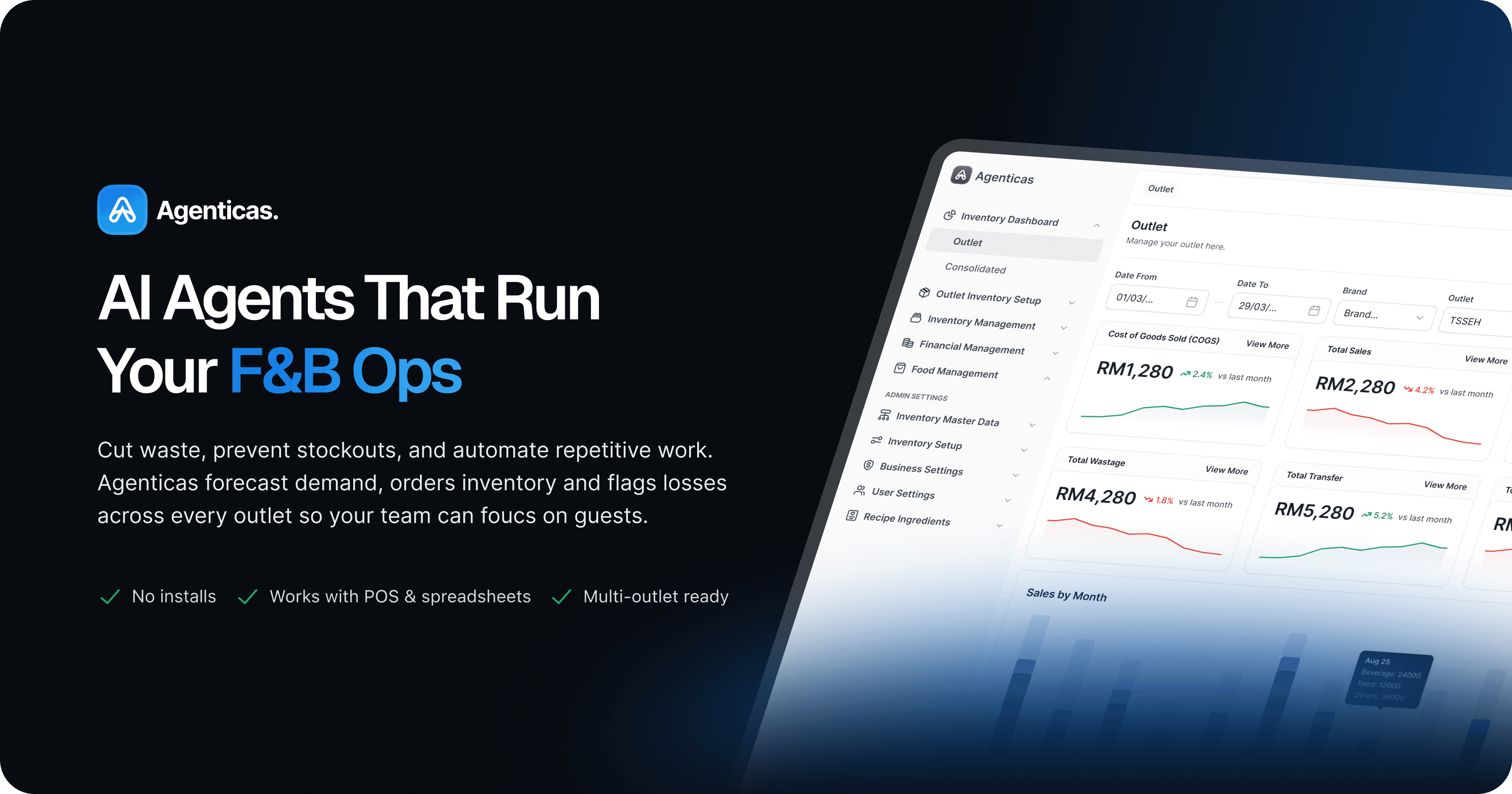
Agenticas dahcboard preview mockup

Client brief meeting, participants: 3 clients, CEO, CTO, Lead Dev, Full-Stack, Designer.
On that meeting, we discussed about the actual COGS must follow a specific formula: Opening Stock plus Total Purchases plus Transfer In minus Transfer Out minus Wastage minus Closing Stock. Every screen in the system had to respect that equation without exposing its complexity unnecessarily to operational staff who simply needed to act.
Before Agenticas - The Spreadsheet Reality
This is what managing inventory across multiple F&B outlets actually looked like. The client maintained a single Google Sheets file of IMS Sample Information with separate tabs for every operational module, such as: Item, Catalogue, Recipe, POS Code, Stock Count, Purchase Order, Item Received, Wastage, and more. Every data entry, every filter, every cross-reference between tabs was done manually. With hundreds of items, dozens of suppliers, and multiple outlets, the margin for error was enormous and the time cost was invisible until you tried to scale.
The scale problem
02 - My Role
I was not a UI executor. I was the only designer who had to understand everything.
My formal title was UI Designer. In practice, I was the sole design representative sitting in every client meeting alongside the CEO, PM, and Lead Developer. I was responsible for converting operational decisions made in those meetings into design direction that a UI designer could execute without confusion.
But, In Fact:
"Two UI designers rotated through the project over three months. Each transition meant rebuilding context from scratch. I was the constant."
Before any screen was designed, designers must understand the ERD!
Sprint 1 did not begin with a wireframe. It began with an Entity Relationship Diagram. Before handing off to the UI designer (me & abqary), I sat down with them to read and understand the ERD together, mapping out how Brand connects to Outlet, how Outlet connects to Department and Storage, how Item connects to Catalogue and Recipe, and how Recipe connects to POS Code and production stock. Without understanding those relationships at the database level, it would be impossible to know why the sidebar navigation needed to be in a specific hierarchy, why Catalogue is structurally different from Item, or why Production Recipe has a unique relationship to inventory stock.

Entity Relationship Diagram (ERD) : This is what I read with the first UI designer before Sprint 1 began. From this diagram came the sidebar navigation hierarchy, the module grouping logic, and the understanding of why certain screens needed to show data from multiple entities simultaneously. Domain translation from database schema to interaction logic that was the real starting point of the design work.
What I designed directly vs what I directed
The landing page at www.agenticas.ai was designed and built entirely by me from zero reference, through three CEO review rounds, to live deployment in Framer. That is the work I own end to end.
For the dashboard system, my contribution operated at two levels. In client meetings, I was the one extracting product decisions and translating them into design direction. In Figma, I briefed the UI designer verbally and through direct annotation, reviewed their output, dropped comments when something was not aligned, and designed specific screens myself when the case was too complex to delegate. The UI designer handled execution under my direction with the lead developer available for deep technical clarification on system behavior.
Parallel project context
03 - Domain Challenge
Explaining a production recipe to someone who has never worked in a kitchen is harder than it sounds.
The most difficult feature to translate into design was Production Recipe. In a standard inventory system, a recipe is a list of ingredients with quantities. You sell a dish, the system deducts those ingredients. Simple.
In an F&B operation like the client's, a recipe is more complex. Some dishes require a half-produce which a batch item made in advance, like sambal, pork lard, or waffle batter that is itself made from raw ingredients. That half-produce is both a product of the kitchen and an ingredient in other dishes. It needs to be tracked as stock, costed accurately, and deducted correctly when used.

Recipe Setup : Expandable rows reveal the full ingredient breakdown inline without leaving the list view. The Production toggle marks recipes that generate a half-produce item for stock tracking. One toggle, significant backend logic, three characters on screen.
On top of that, every ingredient has a yield percentage. If you buy 1 kilogram of lemongrass but only 700 grams is usable after trimming, every calculation in the system such as recipe cost, stock deduction, variance report, has to account for that 30% loss. One yield field in the catalogue, multiplying out across hundreds of ingredients and recipes.

How I briefed the designers
04 - Design System Decision
Choosing UntitledUI and shadcn was a product decision, not just a design preference
Before any screen was designed, the team made a foundational choice about which design system to use because we just have 2 month and maximum 3 months to complete all mockups. We don't have much time since the project was extremely complex, so this was not a decision made by the design team in isolation, but I brought this direction to the UI designer as part of the very first briefing, before Sprint 1 began. The reasoning was deliberately cross-functional, and the goal was to make sure every design decision from day one could be implemented by the dev team without negotiation.
First, we used UntitledUI

Next, we make it sure that our designs matched with shadcn ui components

Directing the UI designer to work within this paired system from the start meant that when the UI phase ended and the development team took over, they could continue building new screens in the same visual language independently, without a designer in the loop.
What I gave up
✕
Fully custom visual identity for the dashboard
✕
Unique component patterns exclusive to Agenticas
✕
Full creative control over every interaction state
What I protected
✓
Fast, clean design to dev handoff via shadcn
✓
Visual consistency developers could maintain after the design phase ended
✓
Time to focus on domain specific patterns that actually mattered
05 - How the System Works
Fourteen modules. One consistent interaction language. Every screen built to scale.
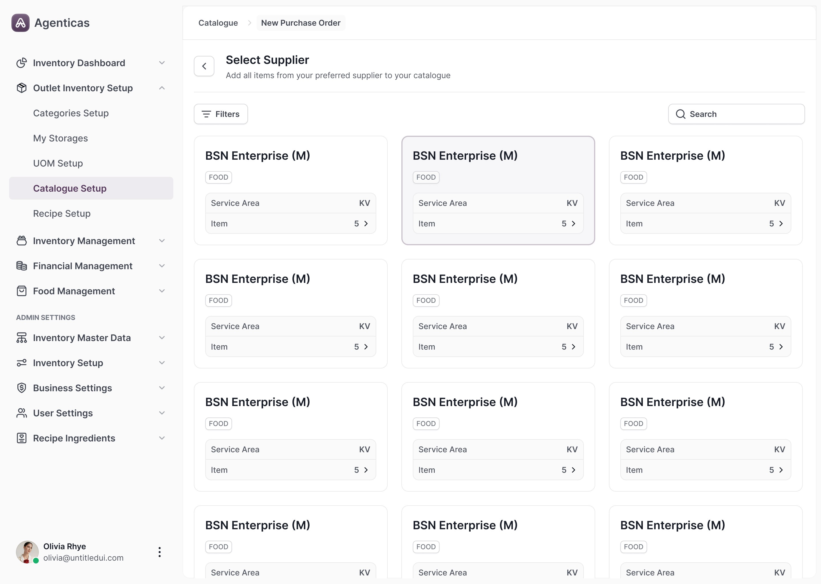
The Agenticas dashboard covers the full operational lifecycle of an F&B inventory operation across four sprint cycles. These are the screens that best illustrate the design thinking behind the system.
Sprint 1 - Foundation and Setup


Sprint 2 - Recipes and Catalogue

Sprint 3 - Daily Operations


The feedback loop - client directly in Figma

Sprint 4 - Financial Management and Dashboard


06 - KEY DESIGN DECISIONS
Every real design decision has something you gave up. Here are the three that defined this product.
“These were not obvious choices. Each one involved competing stakeholder goals, real constraints, and a trade-off I had to be willing to defend with evidence rather than preference.”
Decision 1
Expandable rows instead of detail pages
Navigation Pattern
Situation
The standard enterprise pattern for data heavy systems is to click a row and open a detail page. Every module had enough data to justify that approach.
Decision
Expandable rows throughout the system. Context preservation: an outlet manager checking recipes while planning tomorrow's order does not want to lose their place in the list every time they need ingredient detail.
Trade-Off
A dedicated detail page with more room for additional fields. Worth giving up because the primary use case was scanning and referencing, not deep editing.
Decision 2
Consistent table patterns across all 14 modules
System Design
Situation
With 14 modules, each could have been designed with its own visual logic. Some stakeholders expected each section to feel distinct.
Decision
Every module uses the same layout pattern. Heading with description, Import and Export, primary Add button, Filters and Search, paginated table, action menus in the last column. One exception: Catalogue's Select Supplier uses a card grid because selecting a supplier is a decision making task, not a data scanning task.
Trade-Off
The first time a user encounters any new module, they already know where everything is. The one exception proves the rule was thought through, not applied mechanically.
Decision 2
Semantic color as functional signal only
Visual System
Situation
Status states across multiple modules, brand color, and data visualization all needed to coexist without creating visual noise.
Decision
Three status colors used consistently: green for healthy states, amber for warnings, red for critical states. The violet brand color is reserved exclusively for primary CTA buttons. When something is purple, it means act here.
Trade-Off
The interface is faster to scan for experienced users and more learnable for new staff. Color discipline at this level is rare in B2B products and most systems use color inconsistently by module fourteen.
07 - Battle Story
Designing a landing page with no brief, no handover, and two other projects running in parallel.
Three months into the project, the UI designer's contract ended. A set of outstanding QA issues remained, and I stepped in alongside the QA team to review and resolve design related bugs in the dashboard. This was not a passive review it was a structured process. The QA team maintained a UAT Feedback tracker that categorised every issue by menu, type (Bug vs Enhancement), component affected (UI, Functionality, or both), and urgency level. Some items were marked Urgent. Some had dependency chains across modules.


CEO Direction
At the same time, the CEO came to me directly. The landing page designed by the UI designer was not approved. No feedback document, no clear direction on what needed to change. Just a request to start from scratch. I was also carrying active design work on a separate project for a different client inside Krenovator.
What I DId
I treated the landing page as a standalone product brief. I identified the target audience independently for enterprise decision makers in the F&B industry who would only reach the page through a sales referral, not organic discovery. I designed the full page, built it in Framer, and iterated through three rounds of CEO review. Approved on the third. Shipped within one month, responsive across desktop, tablet, and mobile.
08 - Landing Page
Everything on this page was designed to earn the attention of someone who was already half-convinced.
Enterprise B2B landing pages serve a different purpose than direct-response pages. The visitor arrived because someone referred them. They are not browsing, they are evaluating. That changed every decision I made about structure, copy, and conversion.
Three highlights info that focus on the landing page
1
Headline leads with the operational problem, not the product name
Target users already know they have the problem. Leading with the pain point signals immediately that this product was built for them.
2
Feature section uses specific operational language
Purchase Order, FIFO costing, AI Invoice Scanning the target audience responds to precision over marketing copy.
3
Three-step flow explains the adoption path before the ask
Enterprise buyers need to understand how they would use the product before committing to a conversation. "Contact Us" is the only conversion action because the real sales process happens off-page.
First Landing Page (Rejected)
Second Improvement (Rejected)
Final Approved ✅
09 - Outcomes
The system is live. The design system is still in use. The landing page shipped and stayed.
The dashboard system is deployed and actively used by the client across multiple outlets. Development continues as new operational cases emerge which is itself a signal that the system is being taken seriously as infrastructure, not just a tool.
The shadcn-based design system established during the three months UI phase has been carried forward by the development team without a designer in the loop. New screens are being built in the same visual language. That is the clearest measure of a design system's durability: it works when the designer is no longer there.
Observed changes in how the operation runs
Stocktake went from multi-file manual to one coordinated session
→ Previously, each department counted stock into separate spreadsheet tabs with no shared visibility. With the system, a single Stock Count batch covers all departments simultaneously.
COGS and variance went from manual formula to auto-calculation
→ The Actual COGS formula, Opening Stock plus Purchases plus Transfer In minus Transfer Out minus Wastage minus Closing Stock, was previously built and maintained manually in spreadsheet cells. Any entry error propagated silently. With the system, every transaction feeds the calculation automatically using FIFO costing and yield percentage, eliminating the largest source of silent error in the operation.
Purchasing decisions went from tab switching to one expandable row
→ An outlet manager previously needed to cross-reference the Item tab, Catalogue tab, Purchase Order tab, and Item Received tab to make a single restocking decision. With the system, the same information lives in one expandable row from current stock balance to supplier options to last received price that accessible without leaving the screen.
The landing page was approved after three iterations and is currently live at agenticas.ai. It replaced a version that was rejected at the client level. The design and the Framer build were both handled entirely by me.
10 - Reflection
What I would do differently. What worked. What I now carry forward.
What I’d change
Brief in writing, not just verbally
The briefing process was almost entirely verbal. Written briefs, even short ones, would have reduced dependency on my availability and made each designer transition significantly smoother.
Domain onboarding before day one
I came into the project without a formal onboarding to the F&B domain. A structured domain review at the start of any enterprise project is now something I treat as non-negotiable.
What worked better that expected
Design system as dev handoff strategy
Pairing UntitledUI and shadcn paid off more than anticipated. The development team adopted the system natively and continued without a designer that only happens when the system is built with implementation in mind from the start.
Treating the landing page as a product brief
Treating the landing page as a standalone product brief rather than a visual exercise was what got it approved. Audience clarity drives design clarity.
Principles I carry forward
Don't simplify the domain, make it navigable
Find patterns that make complexity manageable without hiding it from expert users. Oversimplifying breaks trust.
Honest complexity beats comfortable ambiguity
Recipe Setup, Begin Stocktake, the Consolidated Dashboard not simple, but organized well enough that complexity does not become confusion.
A design system's durability is tested after the designer leaves
If the dev team builds in the same visual language without a designer, the system worked. That is the standard I design toward.
BACK TO ALL WORKS
🔥 FEATURED
500 Ingredients, 14 Modules, One Source of Truth
Agenticas is an enterprise inventory management system built for multi-outlet F&B operations. I was the only designer with a seat at every client meeting and the last one standing when the product shipped.

DESIGNER
Muhammad Abqary Nasution | Raffialdo Bayu | Hazrul Aswad
timeline
3 Months UI Phase, 6 Months Development Completion
Collaboration
CEO, 1 PM, 1 Lead Dev, 4 Full-Stack Dev, 1 QA
Ownership
Owned UX end-to-end for the AI assignment flow
Go to top